Each job I take on is unique. So too, each has a unique price to their creation. The examples shown below include a description "itemizing" some aspects of the map and their associated costs. You can see enlargements of the maps if you place your cursor over the image and select "open image in new window."
In these examples I may "rewrite history" and pretend there were no last-minute changes or rush job fees associated in their creation. These cost examples also reflect my current rates.
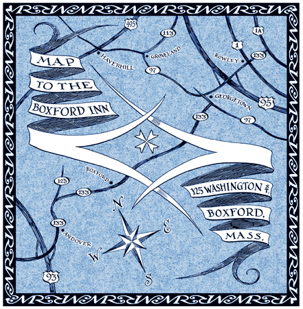
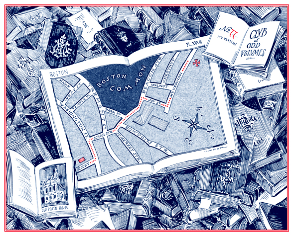
This is a pretty straightforward map. The hand-lettering is not overly complex.
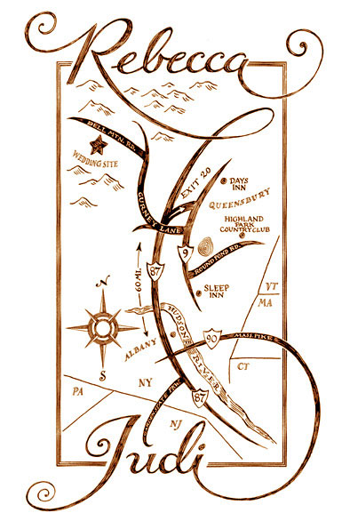
Designing the border, made up of interlocking initials of the bride and groom, accounted for 100 dollars of this map's cost.
A similar map which includes renderings of a couple of buildings, etc., will add to the design costs.
(Should the hand-lettering have been ornate, the costs would have been more, had the lettering been typeset, the costs would have been a little less.)
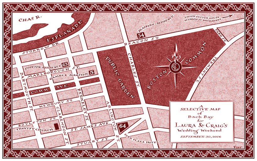
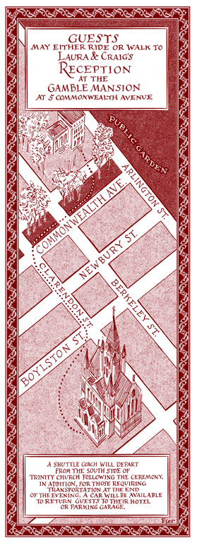
As both these maps were produced for the same wedding, and they share the same aesthetic the pair of them cost 750.
The inclusion of a monogram designed especially for the couple usually adds costs.
If the couple provided a ready-made monogram, this map might run 400 to design.
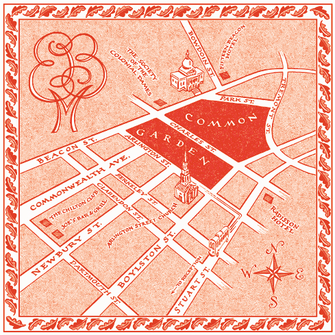
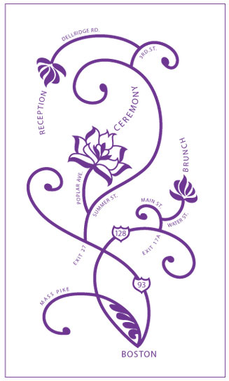
Other straightforward maps showing roads, towns and text banners as well as a decorative borders. The elaborate banners containing the wording added a cost and complexity to these maps. Had the copy been in a rectangle as the ones above, the cost would be around 400. Without the banners and border, 300.
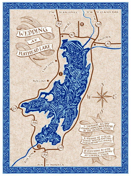
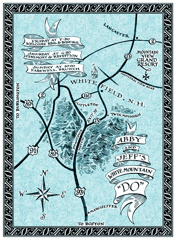
Similar to the maps above, yet this map has two new added costs associated with it. A paisley pattern (addapted from one found on the invitation) was incorporated in the lake and border.
Two colors were used which meant I needed to create two different files for the printing press.
Had the map's title and schedule text been typeset in rectangular boxes the cost would be lowered to 600
Not including the paisley pattern makes the cost 500
Designing it for one-color printing reduces the cost to 400
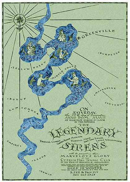
The large size accounted for most of the increased costs associated with this map. When opened it was nearly two feet long. The elaborate gothic hand-lettering was another factor.
The set type used in the key at the bottom kept the costs lower.
Just a note about changes: often an inclusion of a new venue, moving a road or town, or even adding a word or two may require moving lots of other things around. Let's make sure we begin with complete and correct information to start with. Unplanned changes which occur after the process is started will add costs.
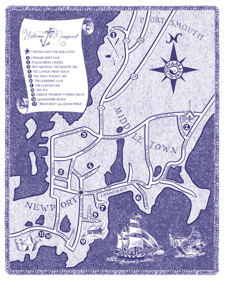
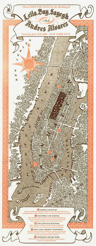
This map had eleven venues on it, each on a different road it seemed. Generally the more places shown and more roads that need to be included results in greater cost. Had there been just three or four the map design costs might have been less. Removing the boat and scroll would reduce costs as well. But at what price? You'd have lost the attractive qualities that make it interesting.
are those which usually involve merging two or more factors into the mix.
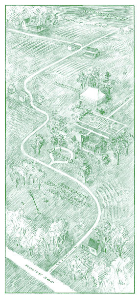
Moving away from the conventions of a traditional map towards a realistic landscape, in this case, involves additional use of perspective and rendering skills.
This map was completed in soft pencil to reflect the atmosphere of the plantation. Had the drawing been completed in ink, the cost would have been 50 percent higher.
Another example of balancing the elements as described above.
Adding, or rather juggling, a second (geographically-unrelated) factor adds cost. Twisting the lettering to fit the roads and visa versa requires alot of trial and error.
Had this map simply shown their names (WITHOUT them turning into roadways) the price would have been 400 or so. Removing the names, 300.
Including the event's invitational text adds complexity and cost. Calligraphing (and sometimes actually composing) the wording for that portion is a job in itself.
Had this map included real roads (rather than "fanciful geography") it would have cost more.
Making the map appear as a "realistic" flower image took some doing!
Also, introducing an additional "medium" to the design process adds costs. The final version of this map was converted into a hard-edged vector file created with Adobe Illustrator. Some printing processes require that sort of digital file.
These make me really smile! They're creative, fun and really meaningful while playing with the whole notion of maps, illustration, and art. Somehere there's a muse makes me see something that wasn't there before. Once in a while their aim hits me right between the eyes, but mostly it requires alot of thinking and searching to find the right way to "make it fly." These maps have an "idea" to them, a "reason" to exist the way they do. Maps of this sort I find are much more beautiful because the have meaning beyond navigation.
Not only did I need to design and draw the map, but also design and draw the still life around it.
Thinking "outside the box" adds value and cost. The elaborate cartouche containing the wording of the invitation and the style of calligraphy accounted for other added costs. Let's focus, rather, on adding VALUE, not cost.
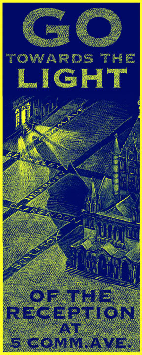
It's hard to put a dollar value on something intangable like an idea. In this case, the idea of the cast shadow of the church turning into the "hand of God" pointing to the reception, which in turn, became the rationale for the "Eleventh Commandmant" text. I guess all I can say is that had I never thought of that shadow, the map would have cost less.
Another inspired idea which involved alot of sketches and trial and error to make it look just right.
 |
||
Click on the links listed below to see the following:CALLIGRAPHY....INVITATIONS....MONOGRAMS....MAPS....SIGN-IN BOARDSFAQs....LINKS....ARTIST'S BIO....FAN MAIL....PRICINGOTHER SERVICES "RENDERED"CONTACT PIERBACK TO THE BEGINNING |
||