|
|
|
Hand-Wrought Tattoos
|
|
|
|
 |
 |
|
|
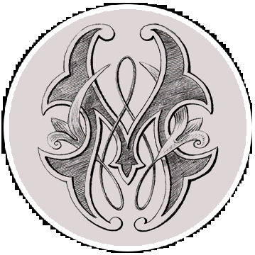
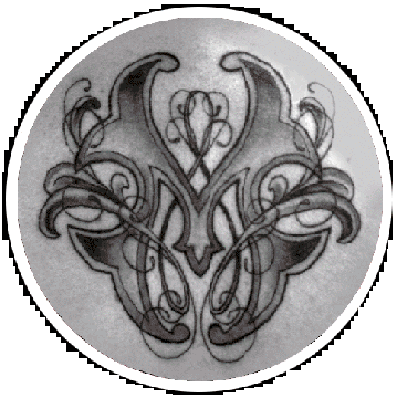
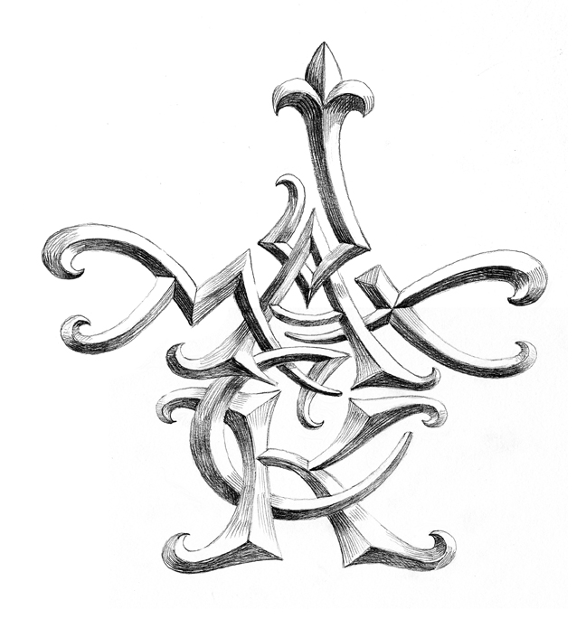
The first tattoo I ever designed is shown above.
It is a M and W intertwined into a monogram. You see the original final sketch and how it appeared in ink on the body. Note that the tattoo artist elaborated the design bu adding hairline swirls and did the shading a little differently. The result is that the W part of the tattoo is less visible, which was fine with the client. Should I design a tattoo for you, keep in mind that the tattoo artist may have their own suggestions as to how it will be finalized in terms of color size and placement.
|
|
|
|
 |
|
|
|
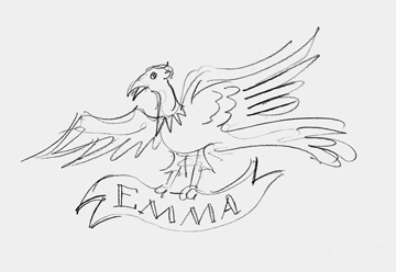
When I think of tattoos, I think of the picture of a flag, eagle, or hootchie-cootchie girl (as Floyd the barber called them) emblazoned on the arm of a sailor. Of course there's the varions of initialed hearts, banners with names, swords, skulls and battleships.
One of those "traditional" types of tattoo requests came across my desk a few years ago. The client wanted the name of his sweetheart in a banner carried by a bald eagle. He supplied me with the sketch above.
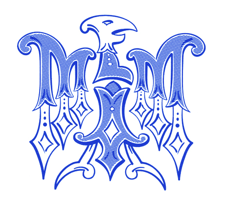
I suggested we make name Emma into a bird. You see the result below. Her name is almost symmmetrical, as are most of the letters in it. The non-symmetrical E became th ehead in profile.
|
|
|
|
 |
|
|
Part of the fun is the puzzle of seeing what the tattoo says. It looks like a teutonic eagle, but imagine his joy in showing that it spells the name of his (now) wife! |
|
|
|
 |
|
|
|
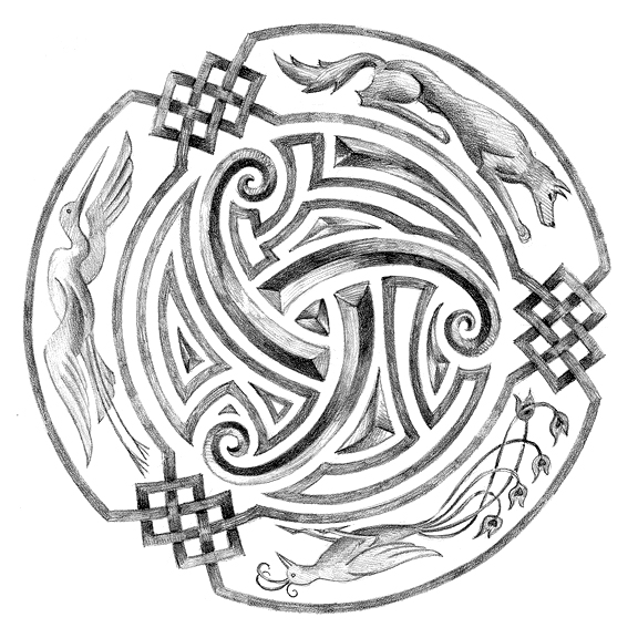
Much more complex was this tattoo.
The recipe was to include celtic knotting and three initials paired with three animals (representing the client's wife, son and daughter).
|
|
|
|
 |
|
|
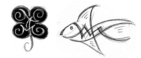
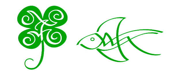
Here was an interesting assignemt. The clients wanted two different tattoos which held the same information (three initials representing the members of the family) in two different shapes. We decided on a fish and a clover the reasons of which shall remain private.
The final is shown below.
|
|
|
 |
|
|
|
They wanted the letters to be more disguised. I suggested they have their tattoo artist ink them up backwards. |
|
|
|
 |
|
|
|
Were you to see the tattoos on the flesh, you'd see the images above. Just a simple clover that represents good luck, and a happy fish. When the owners look at themselves in the mirror, they see the initials clearly.
The secret is known only to them.
(And now, dear reader, to you....oops!) Actually, in reality, I took the liberties to change both the initials and the objects for use on this site.
|
|
|
|
 |
|
|
|
Proudly displayed on the chest of a Canadian soldier are the names of his two sons in the shape of an elaborate cross. |
|
|
|
 |
|
|
|
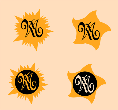
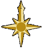
Another monogram-tattoo was to have the initials of the husband and wife, plus a sun, plus some sort of representation of their five children. The colors were to be yellow and black.
I suggested that the sun could have five large points which could represent the children.
|
|
|
|
 |
|
|
|
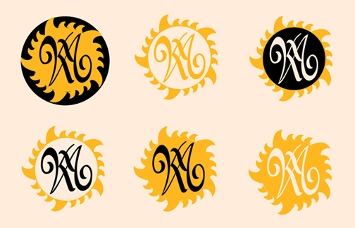
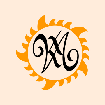
She chose the "saw-blade" sun and then I showed the options for color combinations. I also gave her versions without the black. The one chosen is shown below. I shortened the leg of the K a bit to make it almost symmetrical. |
|
|
|
 |
|
|
|
 |
|
|
|
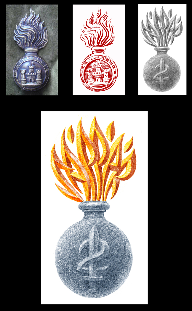
A military man asked that I design a tattoo with his regimental insignia as well as the slang term "Sapper" they use for their special unit. I included the word in the flames exploding above the grenade. |
|
|
|
 |
|
|
|
This monogram tattoo pair was designed for the parents of a family of five, whose last name started with C. The initials of all members are shown within. The mother chose the one with the C, the father, without. |
|
|
|
 |
|
|
|
Designing a tattoo from scratch.
|
|
|
|
 |
|
|
|
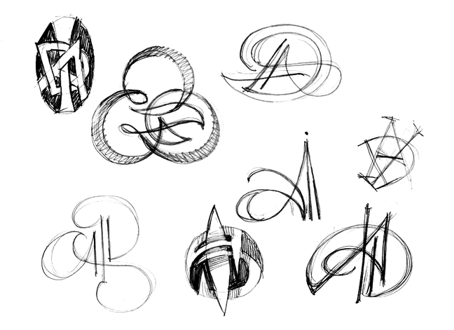
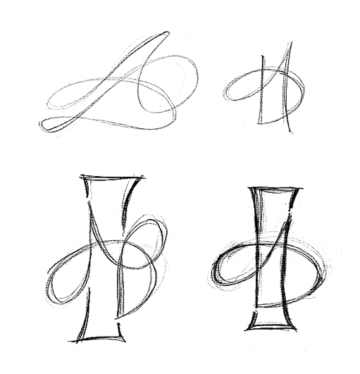
The example I show you here began with a long letter detailing the lives of the pair who wanted "his and her" tattoos. "D" and "A" were the first letters in their names, "I" was their shared last name initial. They also mentioned that they liked the idea of the letters bing slightly "disguised" or not obvious and placed in a circular or geometric form. The set of ideas I came up with are shown above.
In a short time they returned an email with comments. Some were soundly rejected (my sketches, not their comments), others had some interesting points, and some wanted refining.
In this case, rather than going in a half-dozen different directions, I pondered a bit more and came up with the following new design below.
|
|
|
 |
|
|
|
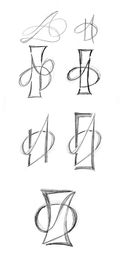
The two letters A and D were drawn with a single line, then that line continued to form the upper-case I.
They loved the new direction. She preferred the version at right as the one at left looked to "B" like, an initial that she wanted to avoid!
|
|
|
|
 |
|
|
|
Refining her choice I came up with the version at the bottom.
The next step involved turning into something more "exact" and less sketchy.
|
|
|
 |
|
|
|
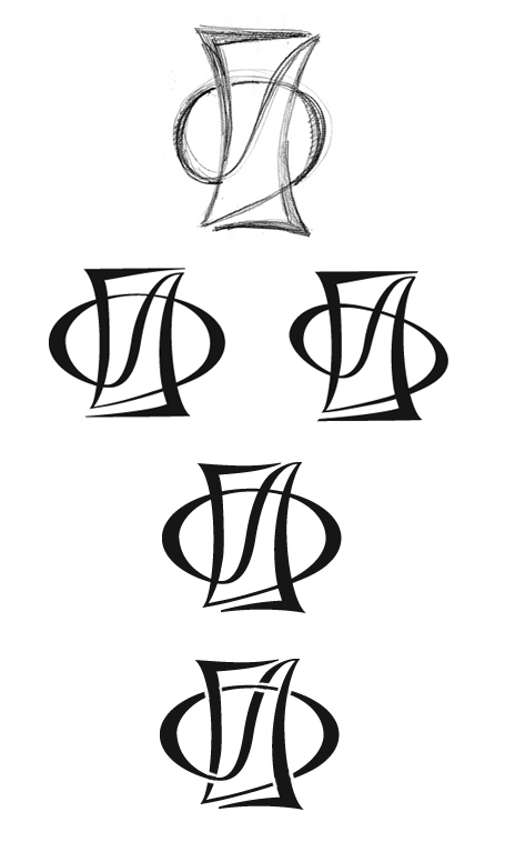
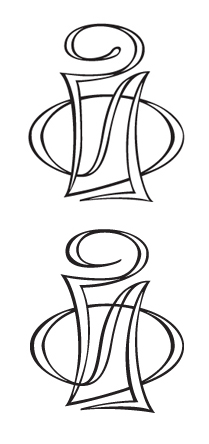
Building it in a graphics program was the next step. In the emails I send the clients I always include where we left off before so they need not look through their old files. At the top you see version 3. Below you see variations.
They picked the one at the bottom, which was my favorite. However, a snag: it was good for the "his" version, but not for her. She wanted it a bit softer.
|
|
|
|
 |
|
|
|
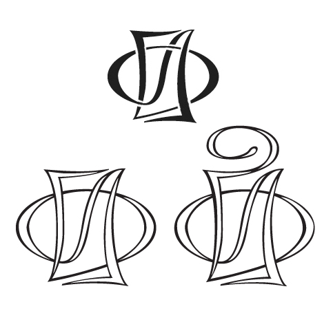
I described making it open in the middle, and she suggested dotting the "I".... so we did both.
Almost perfect.
|
|
|
|
 |
|
|
|
We did a curl-ectomy to make the dot end in a point, just as it started. I also fattened up the diagonal stroke of the "A" |
|
|
 |
|
|
|
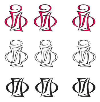
Still not finished, though. I wanted to show them the various options of "interweaving the lines, so you see it as make of a single line going through the motion of creating the monogram.
White breaks in the lines were added to the second column. My preferences are shown at the right.
|
|
|
|
 |
|
|
|
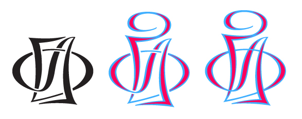
The final is shown here. The colors used in the "hers" tattoo may require the breaks in the lines as shown in the middle, but that is something that the tattoo artist and client will decide.
|
|
|
|
 |
|
|
|
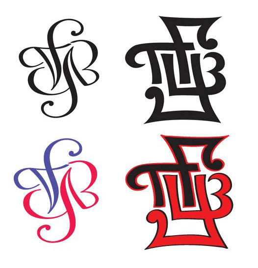
Another his-hers tattoo is shown above. Three pairs of initials are shown representing the two parents (Tabitha Franson and Brad Young) and their child (Fred Young). You see the more feminine script version next to the blocky masculine one.other |
|
|
|
 |
|
|
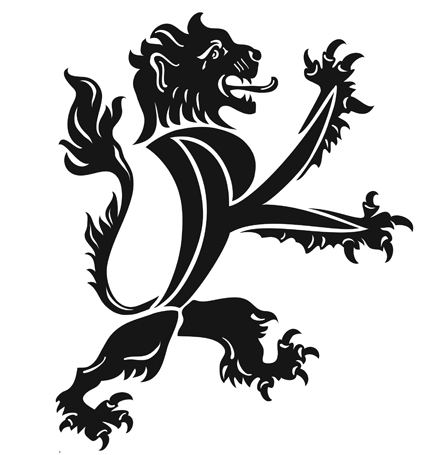
| A monogram that I had originally designed for a wedding invitation was later adapted into the torso of a heraldic lion which eventually decorated the arm of the husband. |
|
|
|
 |
|
|
|
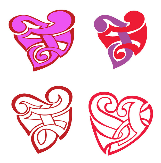
The initials of the client's children were made to fit within, or become a heart shape.
The cost of tattoo design is much like that of designing a monogram. Check the price examples on my pricing page, link below.
|
|
|
|
|
|
|
 |
|
Click on the links listed below to see the following:
|
|
|
|
|
|
|
|
|
|
|
|
|
|
|
|
|
|
|
|
|
|
|
|
|
|
|
|
|
|
|
|
|
|
|
|
|
|
|
|
|
|
|
|
|
|
|
|
|
|
|
|
|
|
|
|
|
|
|
|
|