|
|
|
|
|
|
|
|
|
|
|
|
|
Pen and Ink (or pencil) House Portraits
|
|
|
 |
|
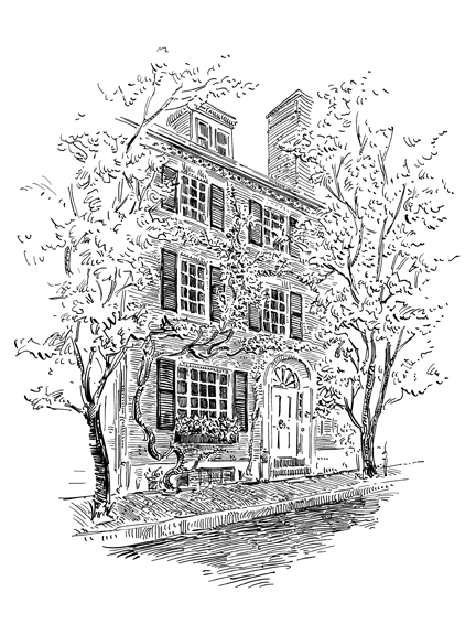
| Here's an example of a pen and ink rendering which was to be used on engraved stationery. Am image like this would be great as a change of address card. This was to be very formal and seen full frontal. Better plan on sitting up straight and no elbows on the table when dining at this house! |
|
|
 |
|
|
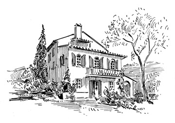
| Fewer details were shown on this informal drawing used to advertise a relaxing vacation at an Italian villa. |
|
|
 |
|
|
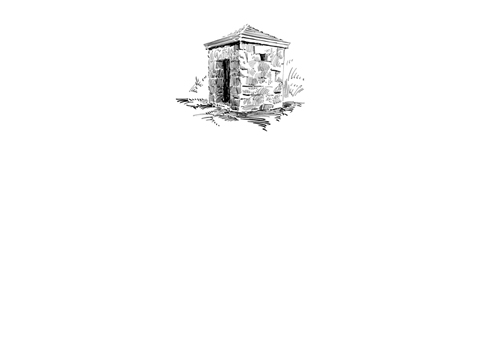
| Sometimes it might be better to focus on an architectural detail of the house, or a small "icon" which represents a property. This simple powderhouse, used in revolutionary times, became to symbolize an entire New England estate on which it sits. |
|
|
 |
|
|
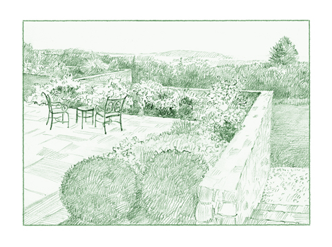
| Or perhaps, as the realtors say, it is the "location, location, location" that is memorable. The house isn't seen at all in this "portrait," but we instead see its patio garden and the vast view to the distant ocean beyond. |
|
|
 |
|
|
| To emphasize this townhouse on Beacon Hill from the connected and identical-looking neighbors on either side, I did a little "landscaping." The trees, not there in real life, as shown framing the structure. It also allowed me to fade off as we reached the edges of the paper.
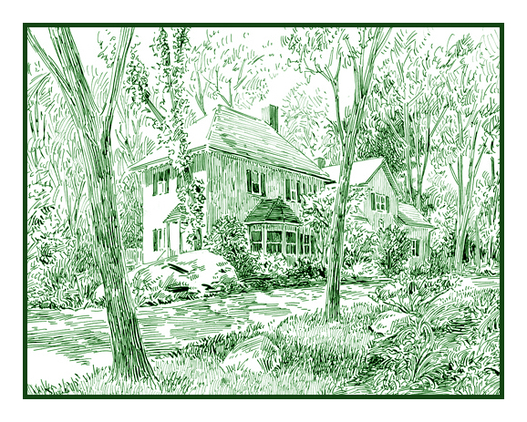
Most of the time, however, I have to do some major pruning of trees and shrubs to be able to show the house in a manner the client desires. Often times the house ends up looking "vulnerable, harsh and lonely" without the protection and softening of the surrounding trees.
|
|
 |
|
| In this case, however, the client appreciated the landscape as much, if not more, than the architecture. I drew the house in its environs. I did move one tree a foot or two to the left to show the sharp edge of a corner of the house. |
|
 |
|
|
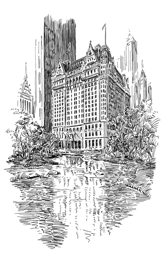
| In this case major movement occured!
The Plaza's more "inviting" and decorative facade was rotated 90 degrees counter-clockwise to face Central Park instead of Fifth Avenue. This way I was able to include a reflection and peaceful trees while omitting the hot-dog stands and a million or two people who might be passing by that busy entrance.
|
|
|
|
 |
|
|
|
|
As you know by now, I like to show you "how" I do things.
I'll use the example of the one you see above.
The client called me wanting a drawing of her house to be engraved on note-cards as an anniversary gift for her husband. She wanted it to be full-frontal and formal, in the style of the image of the White House as seen on the back of a twenty.
|
|
|
 |
|
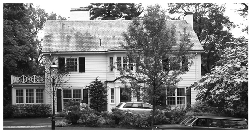
| I drove out to take some photographs for reference. The house you see is surrounded by large trees obscuring much of the house, so I knew they'd have to be changed in some way....but first things first.
|
|
|
|
|
 |
|
|
|
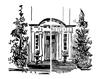
| Scale needed to be addressed. She was planning on having this engraved and printed on notecards. Engraving is the only way to capture the details she wanted. If the final engraving was to be the size of the White House on the twenty, I could include the details as seen on the right side of the drawing. If it was to be printed about 2 inches across, I'd need to render the drawing with fewer lines. It would require something like the details (or lack thereof) as seen on the left. We settled for something in between. The final engraved image was to be printed at about 3.5 inches across. To the drawing board I went. |
|
 |
|
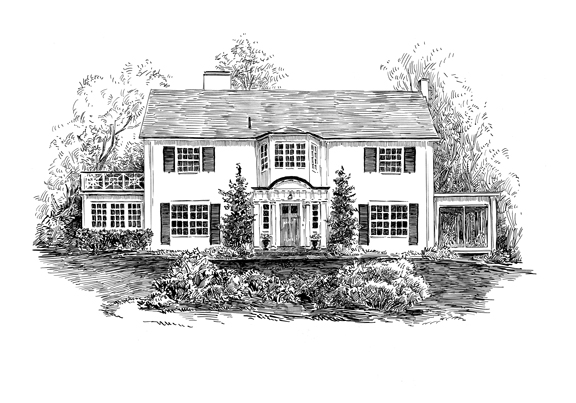
| The house was drawn thus. About 18 inches across in real life. Note that the trees have been removed. Where the trees would be placed had yet to be decided. |
|
 |
|
|
|
|
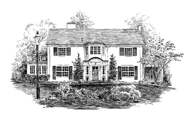
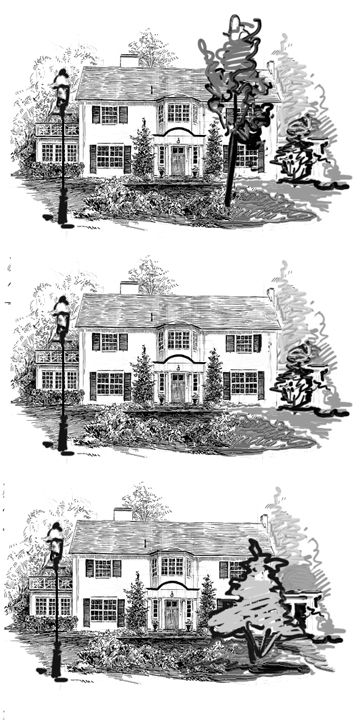
| We spoke on the phone about which trees would be placed where, and how big the trees would be drawn.
Normally trees tower over the house. If I drew the entire tree the engraving might take up the entire page.
As this house is, more or less, symmetrical, I suggested that a large tree be drawn in front as shown on top and the bottom. It obscures half the house, as it does in real life, but the half it obscures looks just like the half that is seen. The client nixed that idea.
We definately needed a tree covering the enclosed screen porch. If there were no tree, one would think it was simply a garage with an open door. Planting a tree in front of it would fix that (there was a tree near there in reality, too).
The lamp post at left was added and enlarged for perspective sake.
The result is shown below.
|
|
|
|
|
|
 |
 |
|
|
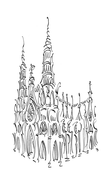
You need not follow traditional rendering styles. Calligraphic linework can bu used giving a more playful and light-hearted look to your Matrimonial Mass.
|
|
|
|
 |
|
|
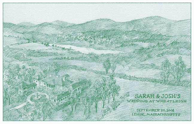
This large estate and it's view of the distant Bershire Mountains combines both house and view, with the help of a bird's eye perspective. |
|
|
|
 |
|
|
Click on the links below to navigate this site.
|
|
|
|
|
|
|
|
|
|
|
|
|
|
|
|
|
|
|
|
|
|
|
|
|
|
|
|
|