Hot off the drawing board
of Pier Gustafson
Below you'll find a selection of a number of interesting projects that have recently been completed for clients around the world. Check back again from time to time as you may see something even newer. Enjoy!
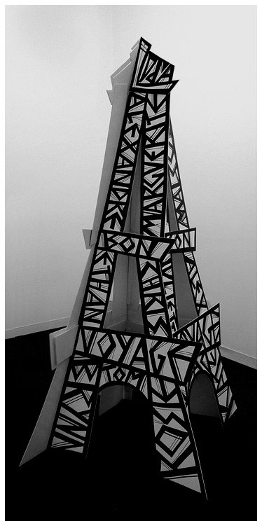
A client had a daughter in a French Class that was heading off to Paris. A Bon Voyage party was planned and the client wanted me to come up with a decorations. Not just any decoration it had to be something BIG. Something to knock their chausettes off.
You see it at left. Built of fom-cor and more than eight feet tall.
Paris' iconic symbol was adapted to the need at hand. The initials of the school caps the tower and the first and second stages spell out "Bon Voyage". The entire class is represented on the rest of the girders...all 28 of them.
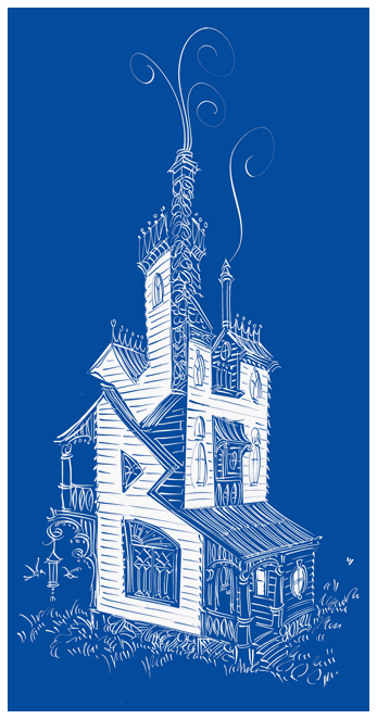
John and Harriet Bender moved from the big city to the country into a quaint Victrorian house.
I wasn't following the blueprints when I drew this fanciful version of their new home as part of their change of address card.
It ia used as the "wallpaper" of the owner's i iPhone and iPad.
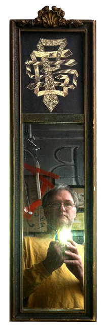
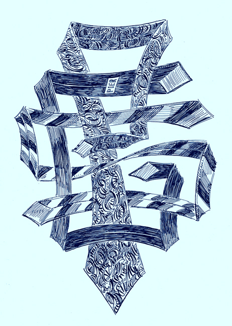
In this case the frame included a narrow mirror below a print of Gainsborough's Blue Boy. Out with the print and in with the appropriatly designed monogram made of the correct article of clothing as this mirror seems only good for adjusting one's Windsor Knot.
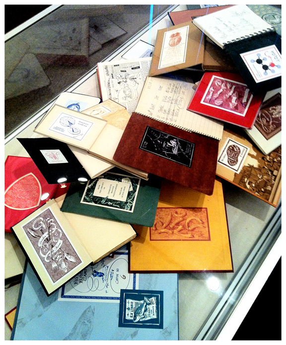
More can be seen on my Bookplate page.
You can read more about it on my Tattoo page
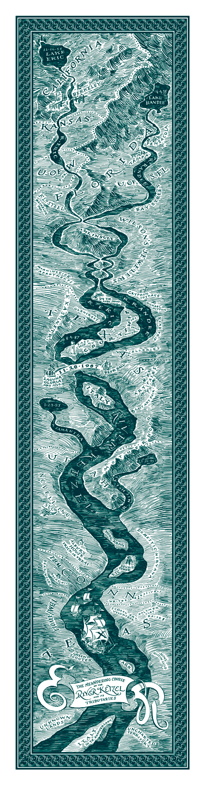
Here is a "time-map" presented to an old roommate of mine by his wife as a 20th anniversary gift.
Real geography was replaced by a symbolic one. Eric's life on the left bank, Randee, the right.
Their births are shown as lakes, the source for the two rivers which flow south towards the future past places they lived, schools attended, jobs toiled at and hobbies they enjoyed.
Even I was included as a point on this map (at the request of the gift-giver).
While both in Florida they met at her workplace, where, in typical Eric-fashion, he somehow, insulted her. That insult represented by a large volcanic mountain.
It tool him three more visits to screw up the courage to ask her on a date.
Then their two rivers flowed parallel to eachother with their courtship recorded as placenames on the shared peninsula.
His proposal, under a lighthouse, was followed soon after by the wedding represented by a connecting bridge spanning the now newly formed "Ketzel River"
The river records honeymooning in Italy, the birth of the two children (represented by their own lakes, rivers and finally smaller ships) along with other trips they enjoyed share geography with other jobs, hobbies and locations lived.
The title legend is in a banner at the bottom which terminates in their first name initials and below that you see Italy again, where they spent their 20th anniversary.
Unknown lands and uncharted territories await their flotilla.
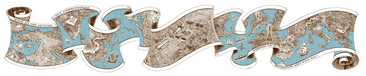
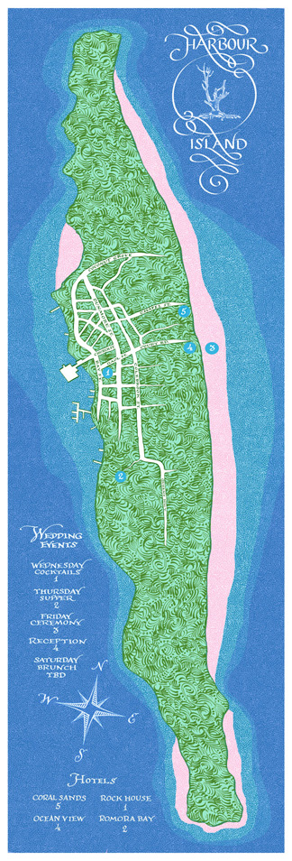
The map shown above depicts an east-coast private boy's school which prides itself on the foreign language program...(and their sports teams, of course). The campus buildings and playing fields are shown in the center with the map continuing left and right including those countries whose languages are taught. Famous monuments and ships, ancient and modern are shown. I added the S.S. Minnow leaving Hawaii on its three-hour tour.
This type of map would be perfect to display someone's travels or the location of the members of a large dispersed family. By taking an apple-peeler to the surface of the globe we can include only those places that are important, leaving out the vast areas which are not. The graceful shape of the ribbon is much more elegant as well.
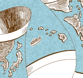
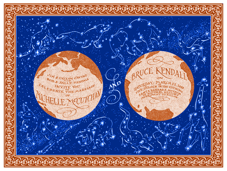
The selective view of the earth's landmasses is shown here, too. By tipping the globe we create an area of open ocean that becomes the canvass for the text of this wedding invitation.
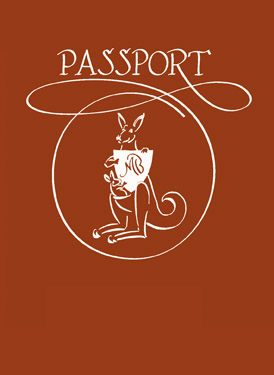
The couple are zoologists who specialize in the fauna of Africa and Australia. I suggested we create a constellation of those animals for the blue background.
Their initals are seen repeated in the map's border and on the cover of the "passport" which was used as the escort card directing their guests to the right table at their reception. The guest's name was written below the kangaroo. The interior was rubber-stamped with the table number, the back cover had their "Thanks for coming" letter.
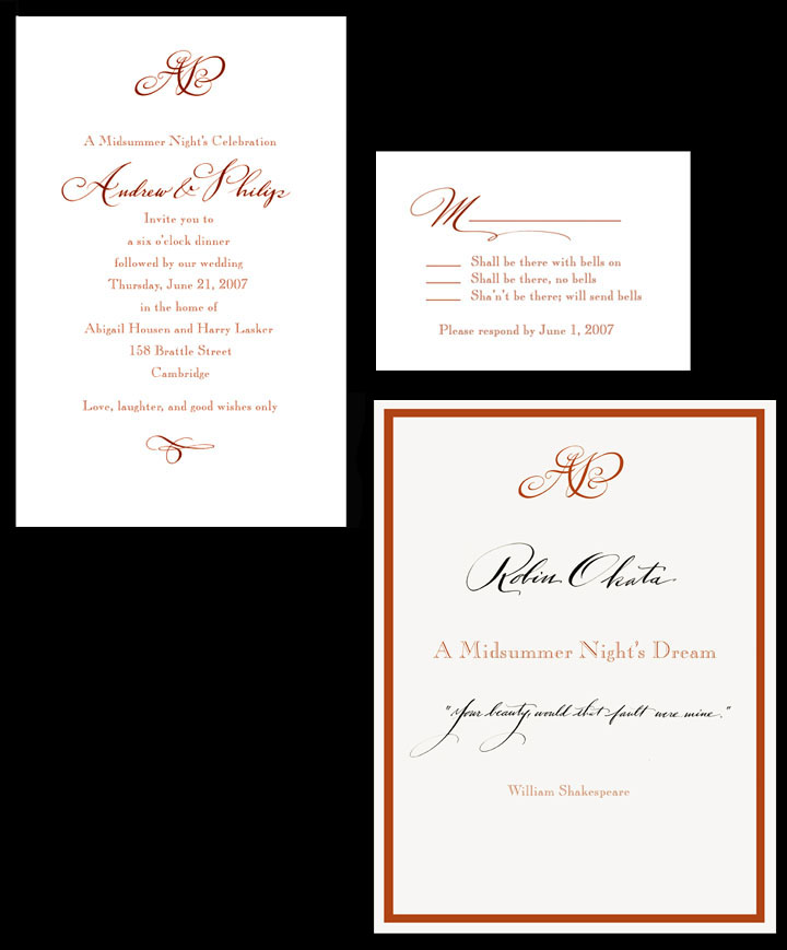
Another fun "escort card" is shown above. The clients commissioned the printing of a hardcover copy of Shakespeare's play as their party favor. I suggested we might as well have it do "double duty." I designed and printed a dust jacket which became the place card at the dinner table. Each guest's name was calligraphed below the monogram paired with a line from the play to represent their personality.
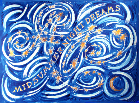
The sign-in board below shows their monogram as a new constellation in the midsummer's night sky where people inscribed (in the white streaks) their hopes and dreams for the happy couple.
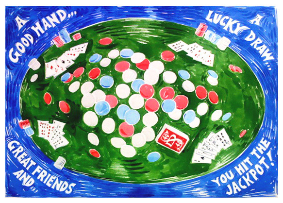
While on the sign-in board subject, here's one that I did for a man turning 40, as shown on the back of the deck of cards at the poker table. The bird's eye-fish-eye view shows His winning hand of the Royal flush. Party goers would inscibe their thoughts on the array of poker chips in the center.
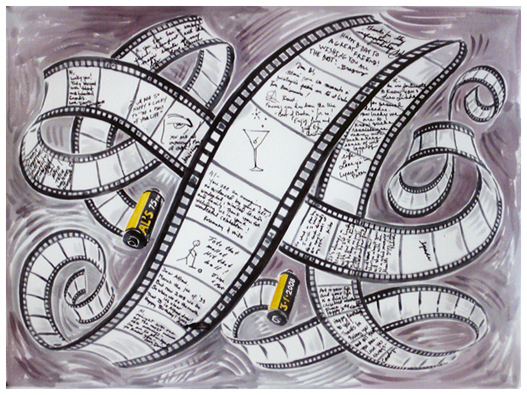
Another milestone was immortalized with this sign-in board. The birthday boy is a noted photographer so we chose frames in a roll of film to be the spots where his fiends wrote poems, draw pictures or otherwise recorded their wishes.
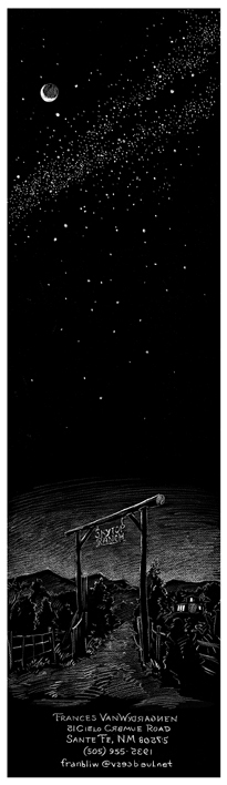
A starry sky reappears in this moving card. The name of the client's home is "Skytop Ranch" which inspired the vertical vista.
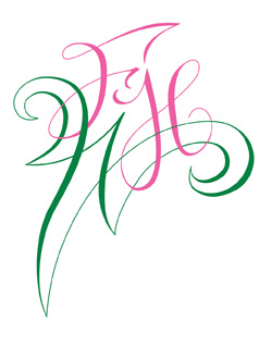
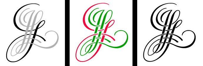
Her monogram is interesting, too. The last name is one involving two caps without a space, so I felt it was necessary to combine the two individual letters into one hybrid shown below.
For a "Welcome Springtime!" party she hosted I reconfigured her monogram thus:
Drawn for the cover of a dress maker's look-book.
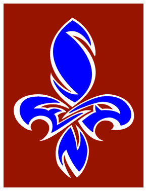
The grandparents also wanted to have their home team included.
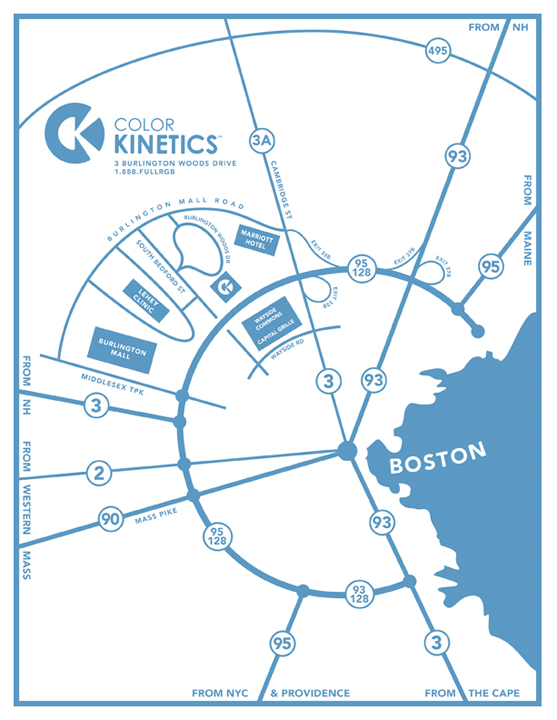
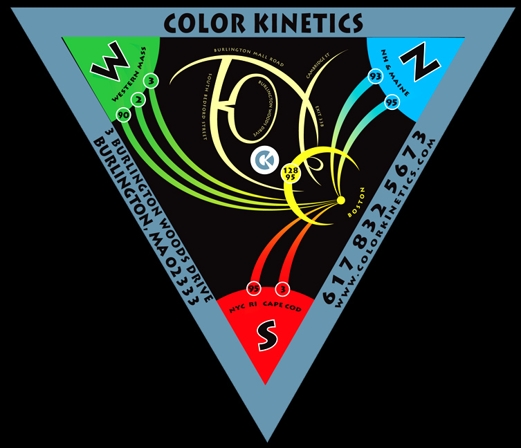
The three primary colors of light are shown in the corners. Perhaps it was their toll-free phone number that made me design it this way. "1-800 FULL RGB"
Explaination as to why it looks the way it does:
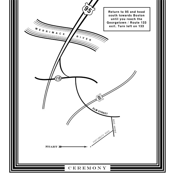
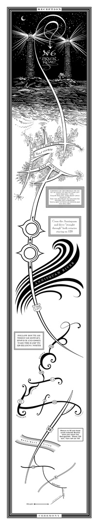
The ceremony was held at a Quaker Meeting House. A Silent Ceremony. This is essentially what happens: The guests arrive and wait in silence. And wait. And wait. No music, no readings, no attendants, no flower girl, no ring-bearer. There's not even a minister. You wait in silence, sitting up straight in rather uncomfortable wooden pews. When so moved by the spirit, the grooms stood and repeated their vows to one another and sat back in silence. We then waited some more. In silence. And waited. After a time the grooms got up and signed their contract which we all signed as witnesses. In silence.
So, as you left the Metting House you were given this map.
It unfolded from the bottom. You saw a tiny simple geometric dot representing the ceremony you just witnessed....the silent one. The road you left on was represented by a simple straight line. You turned onto another straight line, this time thicker, Then to a simple curved line which was followed by a complex curved line. Notice a pattern? You're getting "noisy."
Each section became more and more fun. The drawing style became more and more complex. Line as geometry to line as decoration and finally line as rendering. With a view the couple had out their front window: the double lighthouses on Thatcher Island off Gloucester.
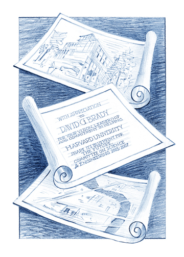
The drawing above is an award given to those who helped plan a new complex for Harvard University. Awards and diplomas need no longer be dull.
Click here to see how it came into being.