|
|
|
WHAT'S NEWER
Hot off the drawing board
of Pier Gustafson
Below you'll find a selection of a number of interesting projects that have recently been completed for clients around the world.
|
|
|
|
 |
|
|
|
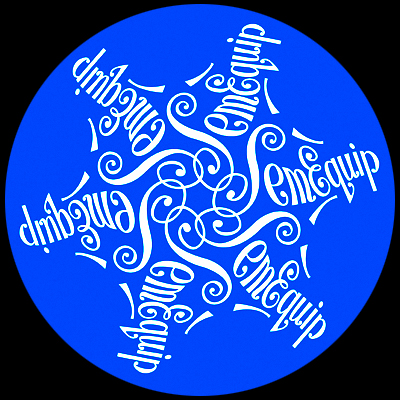
Here's a holiday card I designed for a high-tech company. Their logo was redrawn in cursive lettering and repeated to make a graceful snowflake.
|
|
|
|
 |
|
|
|
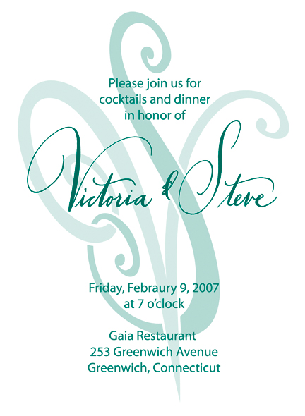
A simple font, a large monogram and handwriting combine to make this a very elegant invitation to an engagement party. |
|
|
|
 |
|
|
|
 |
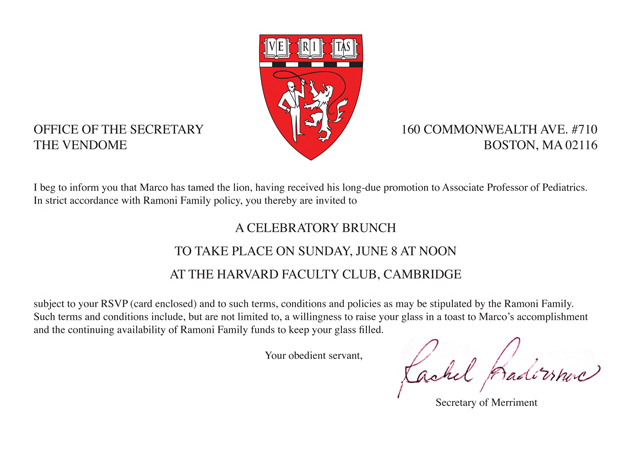
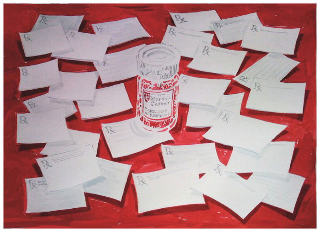
Simple, too, is the invite you see here which mimics the letter Marco got notifying him of his promotion. When I heard his name, Marco, I immediately thought of a lion-tamer, which was what he did...Taming the Harvard Medical school lion. I added him to the heraldic logo as you see.
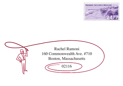
He made another appearance on the address-side of the RSVP postcard.
The sign-in board, below, will be filled with many prescriptions for a successful carreeer inscribed by the guests attending the brunch.
|
|
|
|
 |
|
|
|
 |
|
|
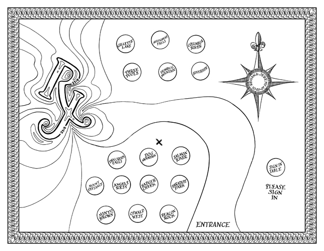
An interesting escort card was this one. The bride and groom, and most of their guests were avid hikers and mountain climbers. Each was presented with this map which included an "X" pointing out their table, Each table was named for a favorite trail or mountain that the couple climbed.
The area at left shows their initials as part of a terrain map.
|
|
|
|
 |
|
|
|
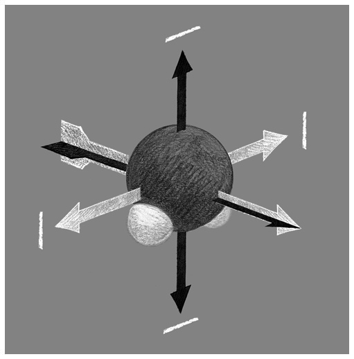
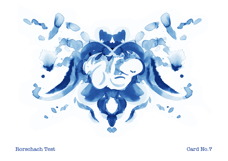
Occasionally I am asked to draw something I know nothing about. This was for a book on the origins of the universe. Polarization of light as seen in this stylized drawing of a water molecule...or at least that's what I think I was drawing!
|
|
|
|
 |
|
 |
|
|
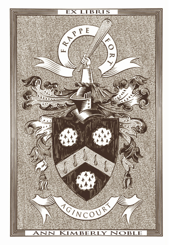
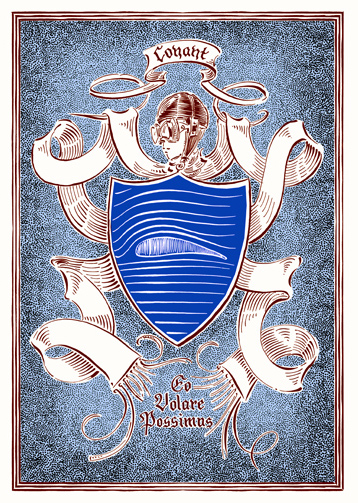
Occasionally I am asked to re-render an existing coat of arms, which you see above left. It was desugned for a book-plate.
More interestinly to me is designing new (fanciful) ones, even if you don't have any blue blood in you.
The one at right was designed for an avid flyer. "I'd rather be flying" is seen in latin between the ends of his long silk pilot's scarf.
|
|
|
|
 |
|
|
|
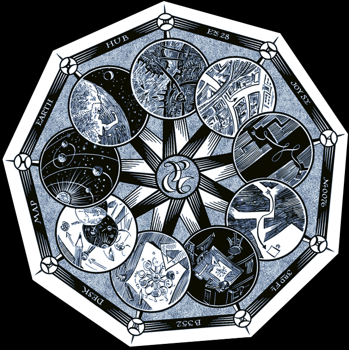
This map shows how to get to my studio from anywhere in the solar system. Inspired by imagry used in ancient mystial rites and alchemy, I wanted this map to be a liitle quirky and puzzling.
The nine-sided polygon is also a little unsettling as your brain wants it to be an octagon, I think.
You start with the solar system, seeing earth and its moon. Zooming in you see the obvious shape of Cape Cod and the Hub of the Universe (Boston). Zooming in more you see the interstate and the correct exit to take. Continuing the zoom, we eventually get to my studio, my desk, the drawing on the desk, and a closeup of that drawing, and VOILA!, you're back where you started. I tried using the most minimal wording as to retain the mystery....and not to chew the food for the customers....let them do a little work!
|
|
|
|
 |
|
|
|
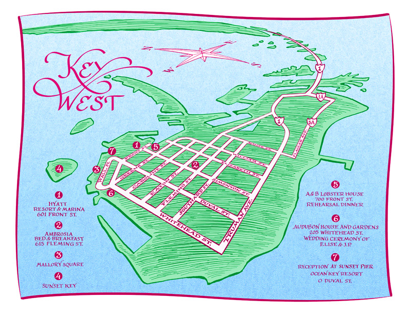
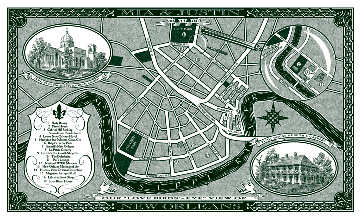
This brightly colored map was used in a wedding on Key West showing the places the guests stayed and were to visit during the weekend. The "hot-air ballon" view is quite good at showing the landscape in a realistic manner, yet allowing us to pick the most important area close-up.
|
|
|
|
 |
|
|
|
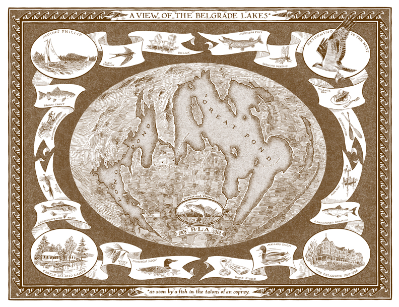
I needed to morph reality a bit on this map, too. There were other lakes in the vicinity of these two main lakes, and would be seen if shown in any regular perspective. I had to look at the are thru a slightly warped fish eye lens to emphasize what was wanted and reduce what wasnt. Hence the fun title's footnote and drawing in the upper right corner.
|
|
|
|
 |
|
|
This map did have a bit of reworking the grid to enlarge a few of the areas of importance. The initials of the couple are seen in the corners of the decorative border. The pattern of the border also makes an appearance in the compass rose.
|
|
|
|
 |
|
|
|
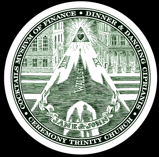
This "map" is also steeped in tradition. A map really wasn't needed to direct the guests three blocks straight down Wall Street to the reception site, so I suggested we create a "logo" of sorts to commemorate the event. The inspiration, of course, is seen on the back of a one dollar bill. Some fancy footwork changed the pyramid and all-seeing eye to the path in perspective surmounted by the all-loving heart. The shadow of the couple and the church is shown cast down the length of Wall Street. Money seemed the theme as the coctail reception was held at the Museum of American Finance. I tried to keep the image as mysterious as the Masonic seal itself, so I left all the street names off the map except that of Wall Street. Roman, rather than Arabic numerals were used to add some of the archaic feel. This was printed first on the coasters, and later engraved in bank-note style on their thank-you cards. |
|
|
|
 |
|
|
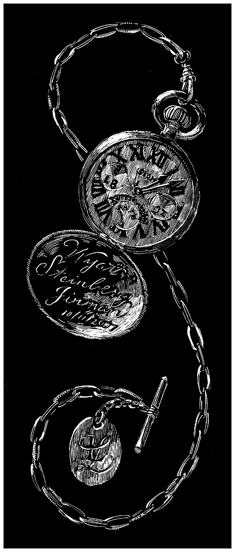
This Swiss-made watch commemorated the birth of a Swiss-made baby boy.
His particulars are shown on the dial as well as the date and time of birth.
|
|
|
|
 |
|
|
|
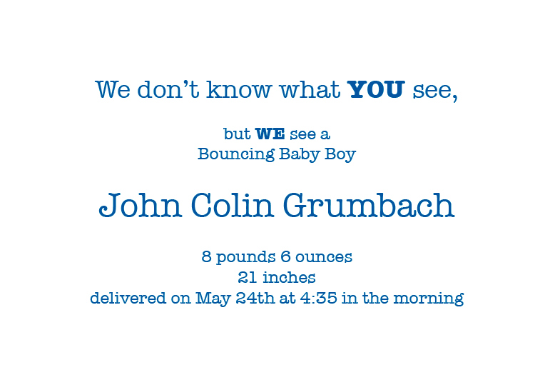
The light bulb turned on immediately upon hearing the professions of both parents. Psychiatrists.
I suggested this design for the birth of their son. The cover is above, the inside shown below.
|
|
|
|
 |
|
|
|
 |
|
|
|
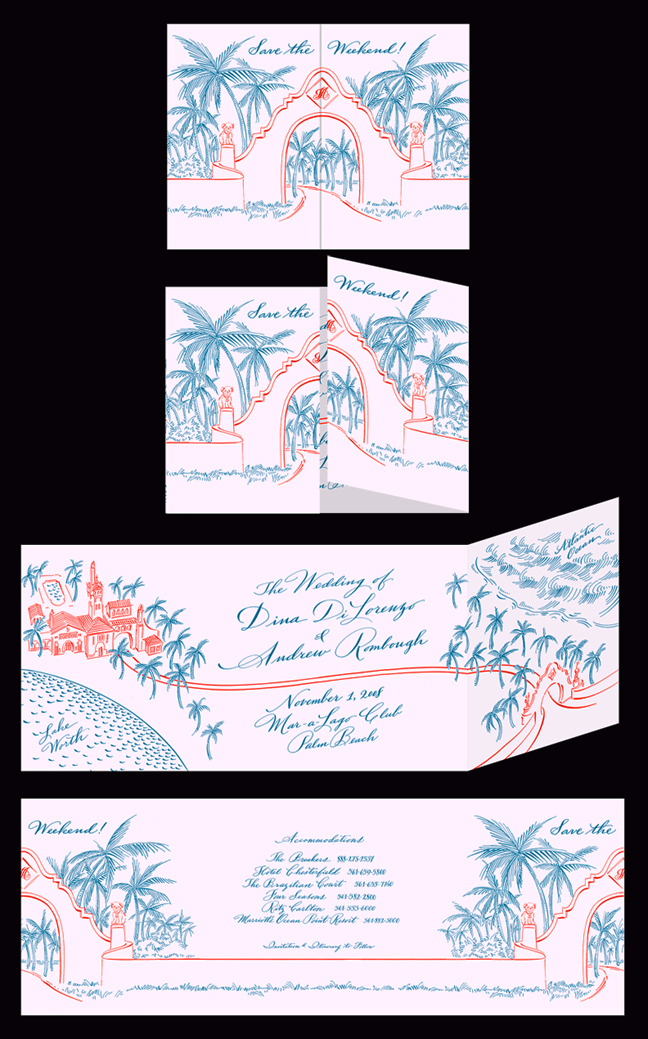
Fun and festive is this save the date ... er, weekend... card. The couple's two dogs are shown replacing the figurines on either side of the main gate surmounted by their monogram. The back includes various accomodation suggestions.
|
|
|
|
 |
|
|
|
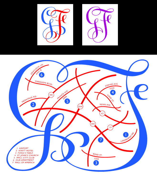
Gwen and Frank Had me design this suite of images. The top pair of images show the pre- and post-ceremony monograms. Below, that same monogram device becomes a delightful border surrounding a map of the various wedding venues. This map was provided to those attending the rehearsal dinner at Fong's Table. A second map, sent to most guests, was printed which did not include that location. |
|
|
|
 |
|
|
|
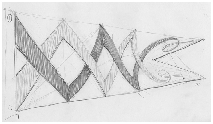
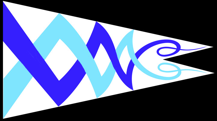
Every year I am lucky enough to be invited to a tiny Cape House for a long weekend away from the daily grind. My Hostess's initials are seen in the flag I designed for her to fly at the beach. The design of the flag is meant to suggest the relaxing "mood alteration" that happens with the warm wind and crashing waves and numerous gin-and-tonics. A rigid straight line bounces back as a slightly curved one, which bounces back again as a double curve, then finally flutters off in gay abandon. |
|
|
|
 |
|
|
 |
|
|
|
 |
|
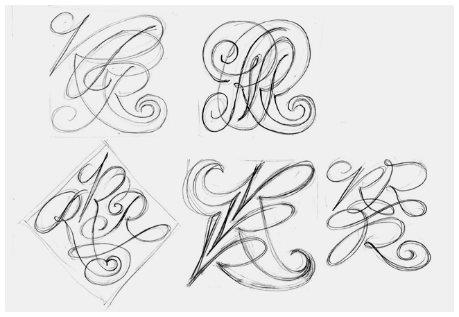
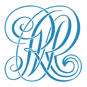
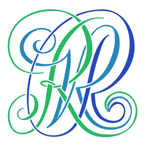
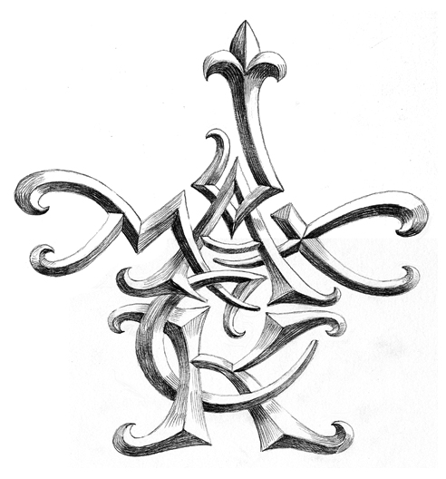
This is a monogram designed for a woman who requested that it fill a square shape.
Three Rs are shown in the final version at left. Each R is in script, but each is in a different type of script, simple, complex and extra swanky, though all tails end in the same spot.
The image on the right helps you see all three more clearly.
|
|
 |
|
|
 |
|
|
|
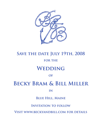
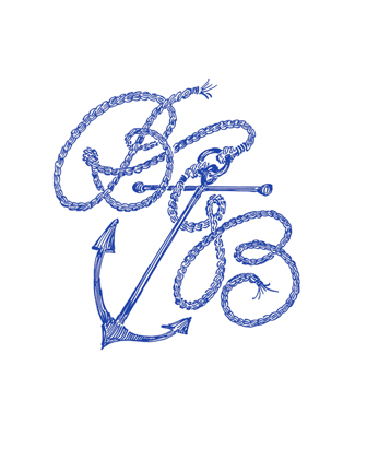
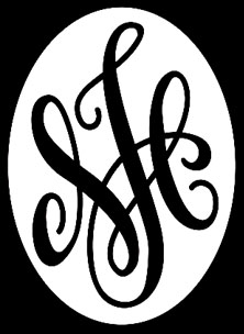
Only two Bs were needed in this monogram. Casual and elegant was this card sent out to their family and friends. |
|
|
|
 |
|
|
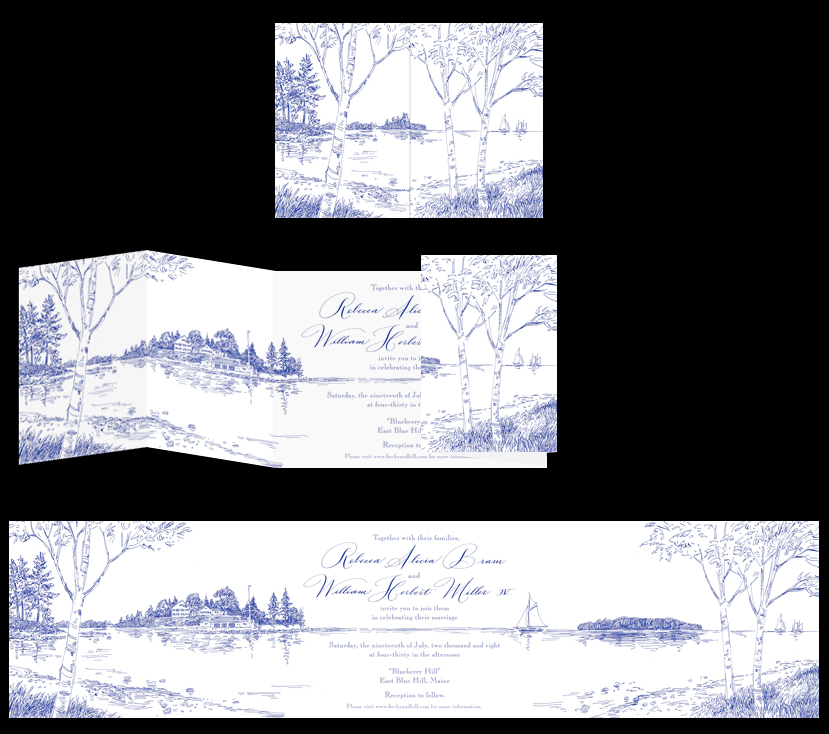
A month later this invitation arrived in the mail. A cozy stand of birch trees frames a view which, when opened, shows a vast panorama and the family estate where the wedding was to take place. |
|
|
|
 |
|
|
|
 |
|
|
|
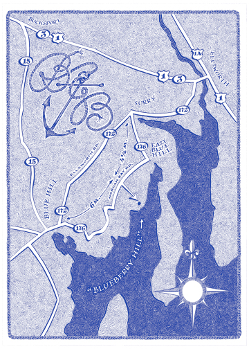
The monogram appears again on the map and on the cover of the thank-you card
|
|
|
|
 |
|
|
|
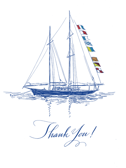
Another nautical-themed thank-you card shows the schooner that the couple was married on as well as the message "thank you" spelled out in signal flags and translated into cursive below. |
|
|
|
 |
|
|
|
 |
|
|
|
Here's a fun job!
As a tenth anniversary present to one another, a couple decided to give the gift of a tattoo.
Each wanted their tattoo to include the initials or full names of their two sons: Jack and Max.
Her tattoo was to resemble a bracelet which contained, in a cameo-like oval, the cursive letters M and J seen on the top of the wrist. The bracelet's band continuing around the back of the wrist, had hidden words and floral decoration inspired by their childrens' Bible.
His tattoo was to contain the full names, vaguely in the shape of a cross, the A in the names being shared. The result is shown here.
|
|
|
|
 |
|
|
|
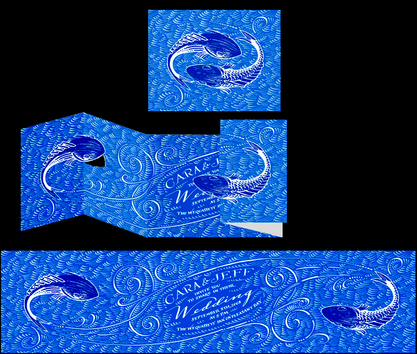
The symbol of eternity, two fish swimming in a circle following eachothers tails, was the starting point for this invitation. We expanded as you see. In their calligraphic wake we find the details of this very informal wedding.
|
|
|
|
 |
|
|
|
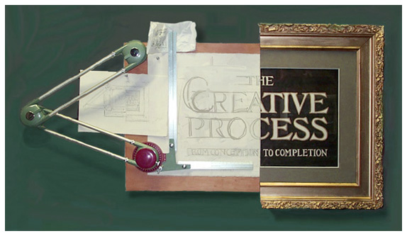
This sign, made up of real elements, was created for an art exhibit I curated.
Divided right down the center, you see half as the completed work, and half as the work in progress work. The more interesting half is at left. The original idea, sketched on a napkin, is also included.
|
|
|
|
Visit again, soon, as I'll be adding more.
|
|
|
|
Click on the links below to navigate this site.
|
|
|
|
|
|
|
|
|
|
|
|
|
|
|
|
|
|
|
|
|
|
|
|
|
|
|
|
|
|
|
|
|
|
|
|
|
|
|
|
|
|
|
|
|
|
|
|
|
|
|
|
|
|
|
|
|
|
|
|
|
|
|
|
|
|
|
|
|
|
|
|
|
|
|
|
|