Illustrations for books, advertizing and magazines.
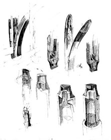
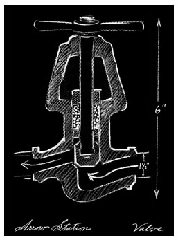
Their readership, being kind of nerdy, were interested in seeing how pens work.
I start with rough sketches...working out the possibilities
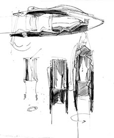
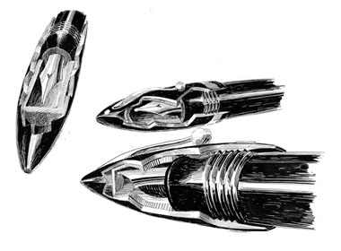
Let's make it exciting by changing the scale.
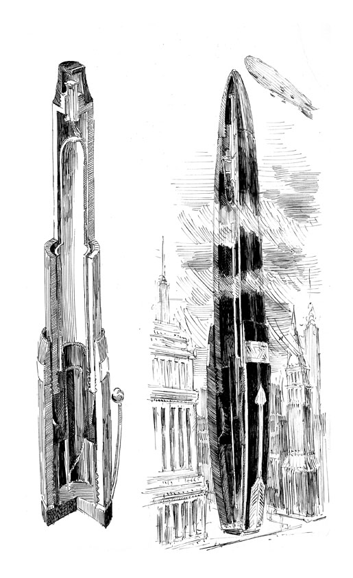
We still see the inner parts and how they work, but we can make the drawing FUN, too.
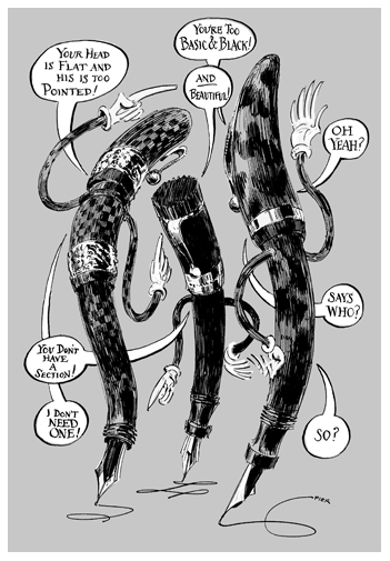
Another way of making drawing of pens fun is to animate them.
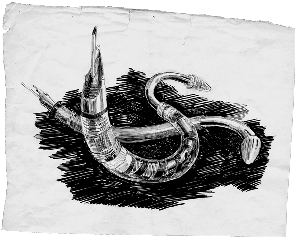
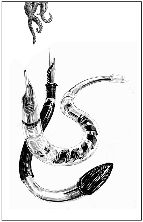
The inner workings of the Sheaffer Snorkle pen were visible for all to see in their demonstarator models which had clear plastic barrels. They reminded me of those see-through tropical fish that so often floated on the surface of my parent's aquarium. So in this case I drew them as animated creatures, twisting about eel-like on the page.
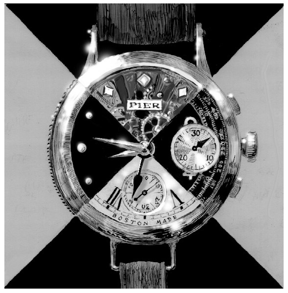
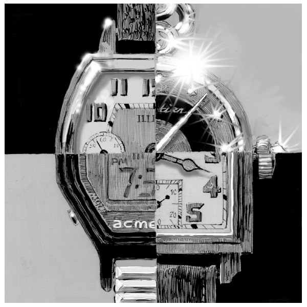
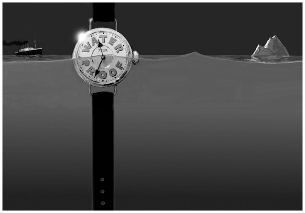
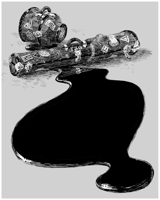
This image was used in a one-page article about traveling with loaded inky fountain pens which oftem leak in airplanes.
The copy of the text was seen on the surface of the spilled ink.
Click on the image to see a closeup.
Let's move to "Paradise on Earth", shall we?
For a series of note-cards, one client asked me to capture on a tiny piece of paper the overwhelming beauty of her vast gardens.
(Panic attack)
I'm not much for growing things. The only thing growing at my place is something in the crisper drawer of my refrigerator, so I was rather at a loss to know how to illustrate something so foreign to me as a formal landscaped garden. Yet she felt confidant that I'd do fine.
I followed her about the landscape and listened to what she said about everything. Not just about this flower or that, but also about the physical work required to make that flower flourish. She was as interested in thel artful presentation of the finished garden as well as "art of gardening" (getting one's hands dirty).
That's all I needed to know do the first drawing!
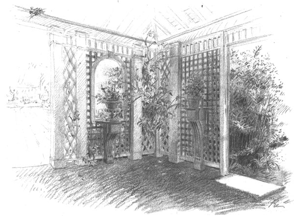
Sitting in the quiet shade of the tea house I picked up the pencil. The two passions of which she spoke were represented right in front of me. In the corner of the tea house were a pair of potted plants upon pedestals. One a formal decorative pot (and plant), seeming almost on stage bowing to the audience. The other, waiting in the wings, was a terra-cotta "working" pot. Through one entrance you see the formal garden with a fountain and sculpture off in the distance, The other portal heads off into the much "wilder" looking rear of that garden. My pencil lines mimic the mood: they are more refined and gentle on the formal "side", more aggressive on the "wild side".
Residents of the tea house were some lucky sparrows. I included their nest in the drawing though artistic license allowed me to position it directly above the bronze sculpture in the distance. That was my little joke. The client mentioned that one of the jobs her husband had was keeping the statue clean of all bird droppings.
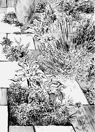
Drawing the plants with a defined sharp line, rather than pencil, seemed more "spicy" to me. There was a texture I could "taste" in ink which I couldn't get in the pencil drawing.

Click on it to see a detail of the Japanese Iris.
