More Hand-Wrought Invitations
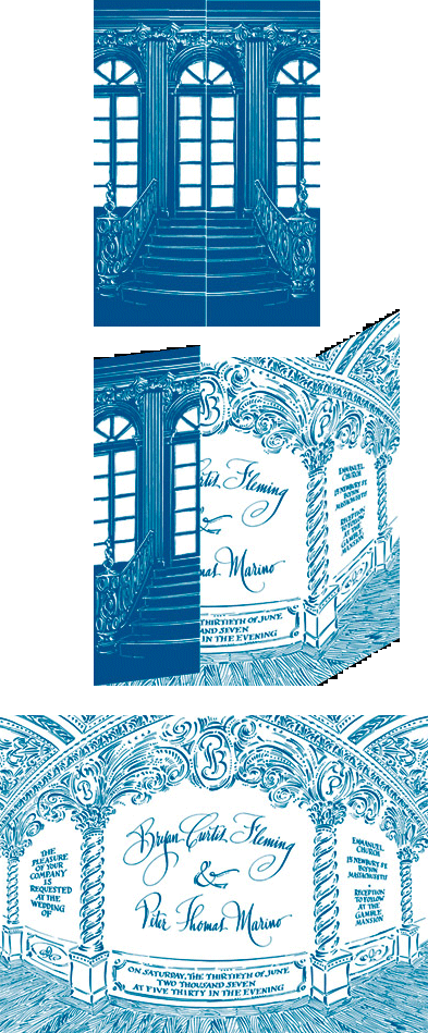
Months later, guests saw the invitation at right. When "closed" it shows the doors of the Gamble Mansion's ballroom as seen from the street. You open the doors to see an opulent interior with the invitation's text calligraphed upon the wall, flanked by two spiral columns, each capped with the first-name initial of the grooms.
Above the central panel you see the monogram I designed for the pair. A close-up and explaination are seen on my monogram page.
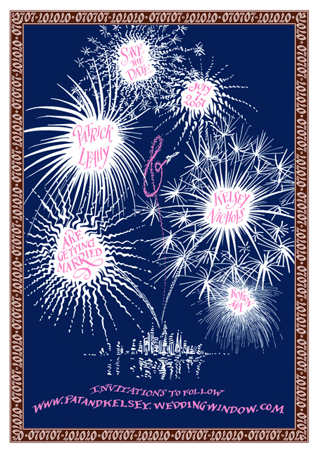
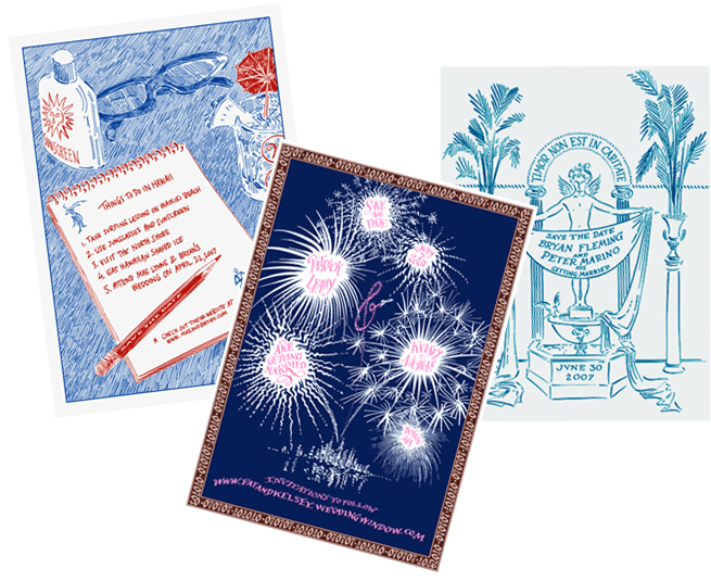
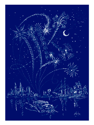
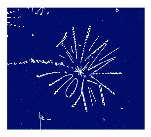
Within you see fireworks. The couple's engagement party had foreworks, and the wedding took place in Boston around the time of the big fireworks display, so that became one of the many themes we used throughout.
As you unfolded it you saw the monogram at the top. It was followed by the cast, then the schedule of the short service.
At the bottom guests saw the monogram again, but something had changed! It now showed the new version which contained the now newly-shared last name initial.
Escort cards, table numbers along with their thank-you cards were designed using the new three-letter monogram and a border of the oh-sevens that you saw earlier.
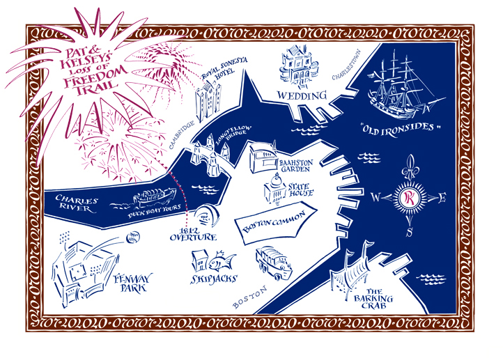
I created this landscape showing all of the wedding's elements. Going full-circle from the save-the-date card, but now the fireworks display the new monogram in the night sky.
The small burst at the bottom conveys the "thank you" message.
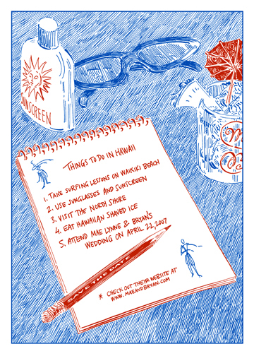
The monogram and the hula dancers evolved!
On the save the date card we see the initial rendition of the monogram and the first position of the dancers. The monogram is included only partially as a decoration on a cocktail glass. You do see enough of the initials M and B to connect it to the couple in question.
The two dancers appear as roughly-drawn "doodles" on a pad of paper. They seem not even to notice eachother and very far apart.

The initial conversations I had with this client began with a discussion about their personal cocktail, of all things! It was aptly named "Plan B" as much of their courtship involved snafus with well-made plans which required adapting an alternate. The knew they wanted to commemorate that quirky history by giving each wedding guest an engraved cocktail glass emblazoned with their monogram and the printed recipe for that refreshing concoction. That's how we began this particular design. Everything flowed from that seemingly odd starting point of a wedding favor, usually one of the last things a couple considers in their wedding plans.
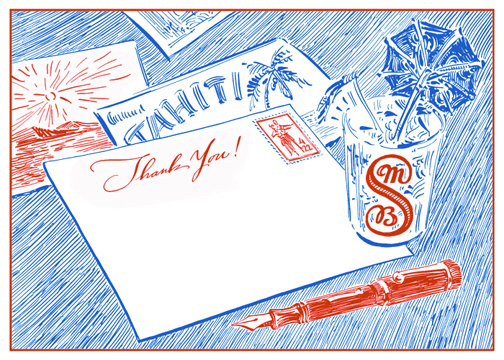
Garnished with a pineaple and umbrella their guests saw it not only on the save the date card, and on the table at the reception, but also on the thank you card shown below.
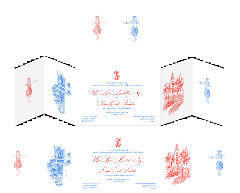
Observant guests noticed another subtle change to the monogram. Linework was added within the "S" as shown in the engraved glass above and on the rendered version below.
The ultimate detail was the inclusion of the final position of the hula dancers, now happily together at last! They are depicted on the postage stamp emblazoned with the date of the wedding.
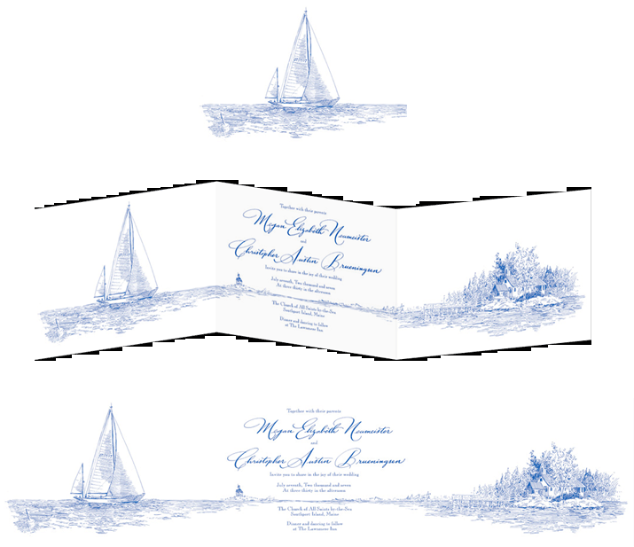
Other paper products had larger and more fully rendered examples of the small details seen on this invitation, namely the lighthouse (aptly applied on the direction card) and a lobster bouy (decorating the guest's place card at the lobster-dinner reception). We could have simply "cut and pasted" the sailboat and used that over and over, but my pen still had ink in it, and there was a blank piece of paper, so why not draw something completely new, and more appropriate for each element?
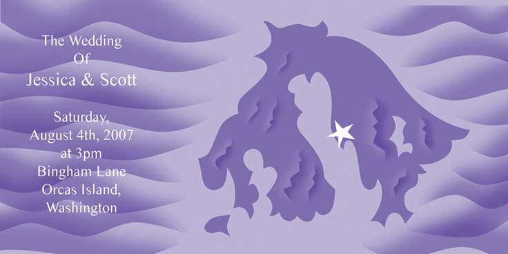
The manner of rendering was quite different from the usual pen and ink work. Modern typefaces and airbrushing gave this invitation a crisp, clean modern look.
The map, not really navigational, provides a lovely decoration for the piece.
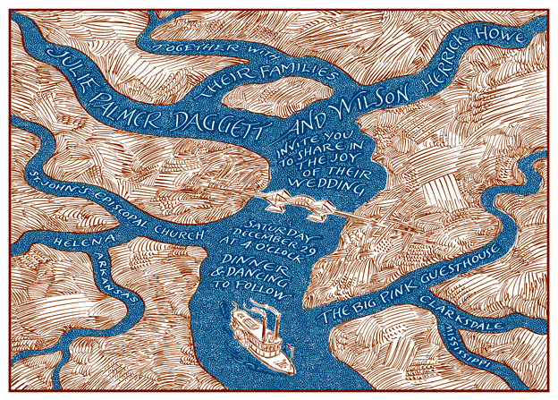
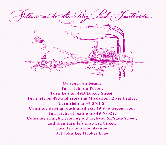
Originally the client wanted me to do an illustration of the church and the reception location as part of a panoramic landscape similar to the layout of the Maine wedding, yet the building where the reception was to be held was rather plain. I suggested taking a bird's eye view might be more interesting. That change of perspective made me design this imagined river "map" which shows two rivers converging, (just as they were to converge) and becoming one. The bridge is equally symbolic of "connection" and "transition." The steamboat represents the couple embarked on their joint journey downstream into the bright future.
That riverboat will reappear on the direction card to be given out as guests leave the church to head to the reception site. (shhhh, don't tell anyone, let it be a surprise)