Custom Event Maps from Scratch
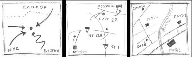
First we need to decide whether a map is really needed. If needed, we'll have to decide what sort of map it will be. Some maps will direct guests from their homes located all over the countryside to a single spot: a small-town church. Another map may direct people from one (starting) point to an ending point.This map can be used to direct guests from the church to the reception.
Perhaps your wedding is on an exotic island. All your guests arrive by air and stay at the same hotel. You may prefer a "walking map" that shows your guests areas of interest: museums, shopping areas and selected restaurants as well as the location of your wedding ceremony.
I'll show you how one map was designed from start to finish.
In the following case the clients needed a combination of the first two maps.Their guests would drive from Boston to the ceremony at an outdoor park in a nearby suburb, and later, from there to a restaurant for the reception. Cars would be the mode of transportation, so roads needed to be accurately drawn.
As Boston is notorious for their poor road-signage I suggested the inclusion of easily recognizable landmarks so they knew they were on the right track.
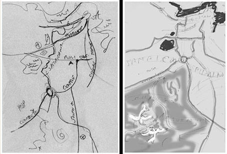
I'll rearrange that information to fit the shape and size required. Certain areas may need to be re-scaled to fit the page. If the map is to have a legend, written directions, title, or key, we'll have to make sure there is room for that as well.
In this case, I de-emphasized the scale of Boston as well as turned the map a bit to the right to maximize the space I had at my disposal.
Now for the FUN part!
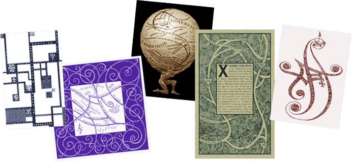
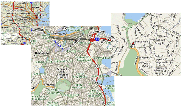
The overall aesthetic of the map now will be considered. The maps pictured above are all showing how to get to the same place: an art gallery near Boston. These were designed to compliment its diverse exhibitions. In the cases pictured above, the decoration, as beautiful as it is, did not interfere with the information it was to convey.
Shall your map compliment your invitation in some way?
What colors do we have to work with? How will the map be printed?
Will the roads be drawn in black with white lettering? Or the opposite?
Will the lettering be hand-drawn or computer generated?
These are just a few of the many concerns that need to be addressed by your cartographer.
In this case we matched the style of the arts and crafts invitation. The map would be printed in one color, it would include a texture of stippling for the background. Rather than an "X" marking the spot, we would have a pair of birds circling above the exact location of the ceremony. (The couple are avid birdwatchers.)
Once all the parts of the map are arranged on the page in a way that looks "right". We focus attention to the map's decoration...making it "pretty", as it were. For example, a border can be designed using the repeated intertwining initials of the couple.
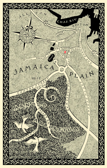
The red "Z" was hand-drawn on each of the printed maps. It showed the location of "Zola's", the restaurant where the reception was to be held. It was our subtle splash of color that was used in all other elements of the invitation, envelope calligraphy, and placecards.