|
|
|
MORE HAND-WROUGHT MAPS
By Pier Gustafson
|
|
|
|
 |
|
|
|
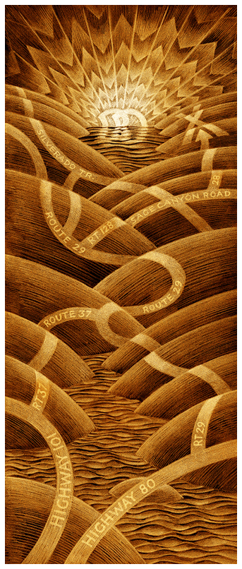
This map was inspired by the Art Deco era.
You see the monogram of the couple (BD) as the setting sun.
The map shows how to get to their Napa Valley wedding from San Francisco.
|
|
|
|
 |
|
|
|
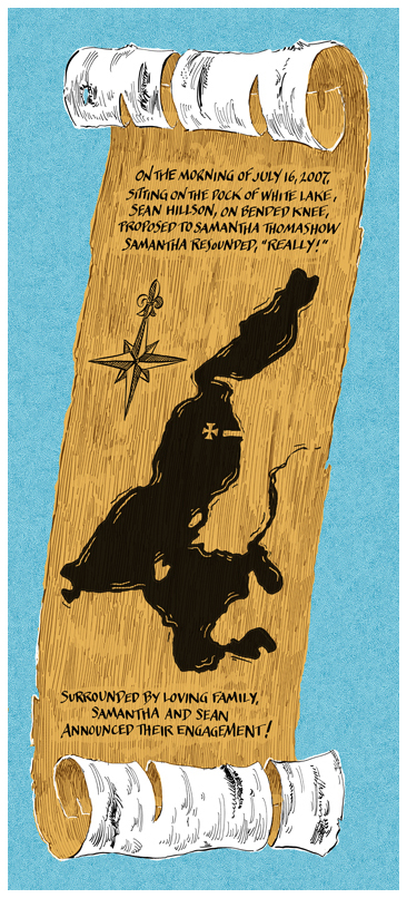
This map, showing the location of an engagement, was commissioned by the bride-to-be as a gift to the groom-to-be recording the happy event.
It occured at the same rustic camp where he spent his summers as a young boy.
|
|
|
 |
|
|
More traditional looking is the map at left, designed for the book "Octavian Nothing" by M.T. Anderson recounting the life and times of a young slave in Colonial America. |
|
|
 |
|
|
|
-
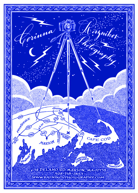
This map, showing the location of a photographer's studio on the south shore, was inspired by the RKO Radio Picture logo.
|
|
|
 |
|
|
|
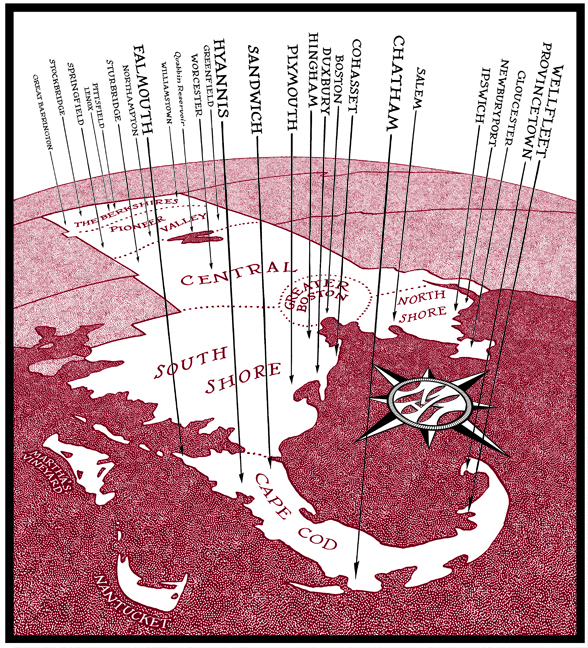
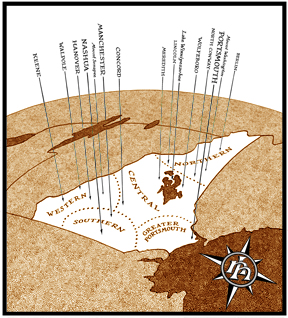
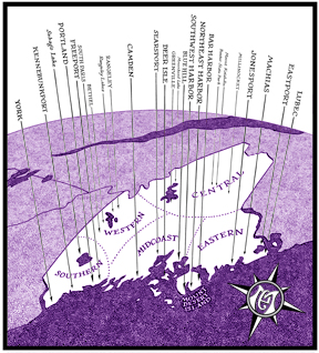
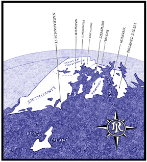
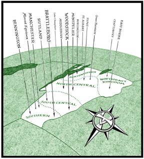
You see the same curvature of the earth in this map designed for a travel issue of Boston Magazine showing the locations they pinpointed in their articles. The rest of the New England states are seen below. The compass rose contains the two-letter postal code for each state.
|
|
 |
|
 |
|
|
 |
|
 |
|
|
 |
|
|
|
 |
|
|
|
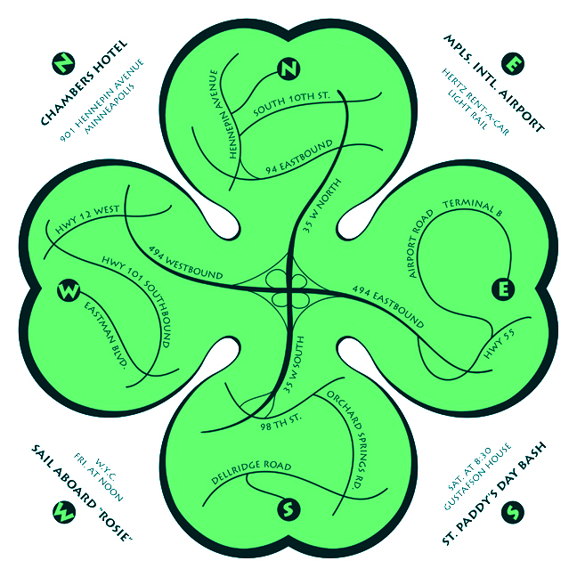
Here's a map showing how to get to events of a St Paddy's Day Party Weekend. The appropriately shaped cloverleaf shows the cloverleaf of the main highways in the center.
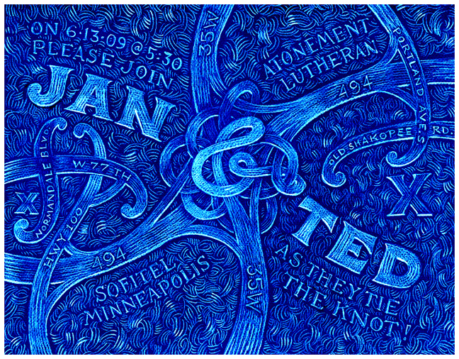
The same intersection is seen in the wedding invitation below. Jan and Ted met while they worked on the repaving and construction of the new 35W.
|
|
|
|
 |
|
|
|
 |
|
|
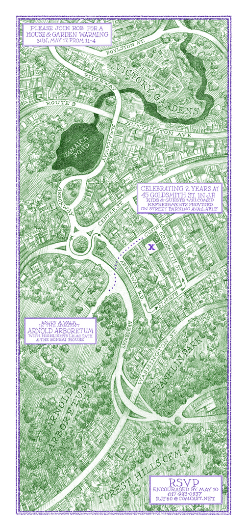
| Another map does double duty as invitation to a house-warming party.
In addition to the new house and garden, it shows the location of the owner's old garden plot at the Fenway Victory Gardens, the inspiring Emerald Necklace and his place of work.
|
|
|
|
 |
|
|
|
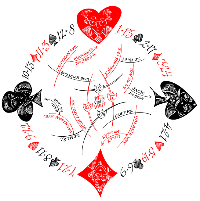
This map does double-duty, too. It shows the locations and portraits of the four hosts of a monthly card came. Around the map you see the not-so regular schedule of Wednesday nights.
They needed a map as they invited new people all the time in their (I think rather futile) attempt to re-popularize the game of Whist. But they always had loads of chips and cases of beer at these events, so they were quite popular.
|
|
|
|
 |
|
|
|
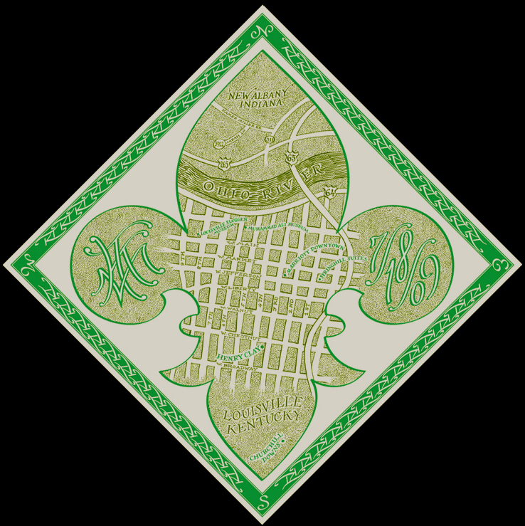
A wedding map in the shape of a fleur-de-lis. In the two side portions you see the monogram of the couple and the date of the event.
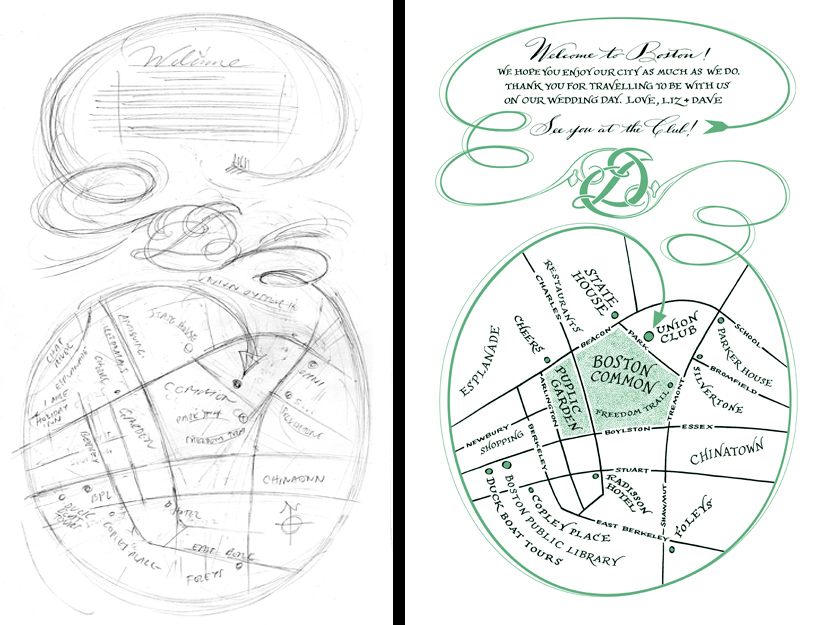
A monogram is used as a compositional device on another wedding map below. It appeared in the gift baskets for the out of town guests. You see the original pencil plan at left.
|
|
|
|
 |
|
|
|
 |
|
|
|
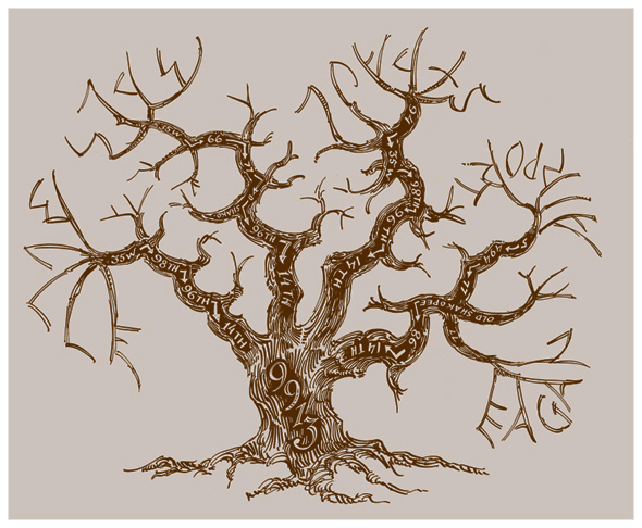
The twigs of the tree spell out the starting points (Eagan, Airport, St.Paul, MPLS, and B(urns)ville) on this map showing the location of a property noted for the many trees that grow around the house.
|
|
|
|
 |
|
|
|
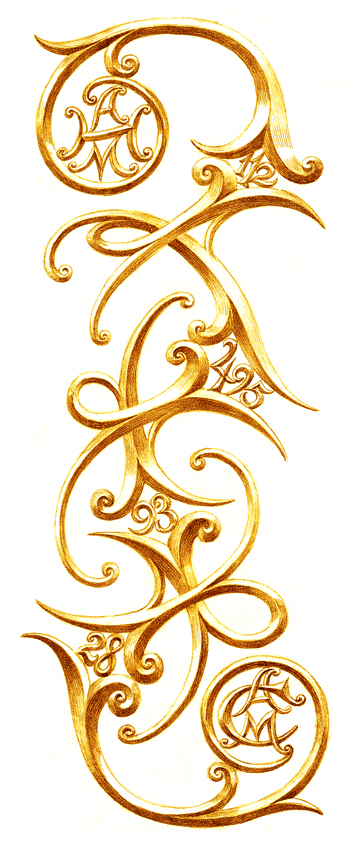
Contrasting to the angular gnarled branches of the oak you see here gracefull golden curves showing the location of a pair of sister-antique malls.
They were built along numbered roadways separated by numbered highways. No need for street names on this map.
|
|
|
|
 |
|
|
|
 |
|
|
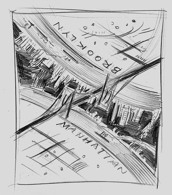
This was fun!
To get from work to home was a brisk walk over the Brooklyn Bridge. For the return trip, just turn the map upside down and go back the other way. You see that Brooklyn has the much nicer view.
|
|
|
|
Less fun was the map below!
It just took way too long to get it right, and I am still not sure whether I ever got it right.
|
|
|
|
 |
|
|
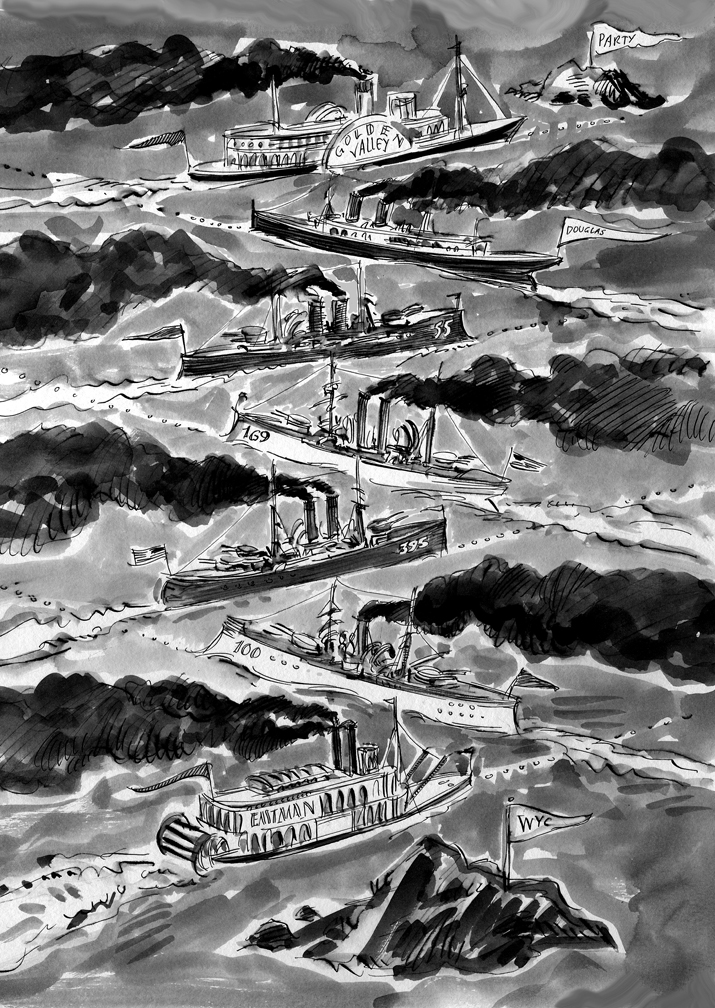
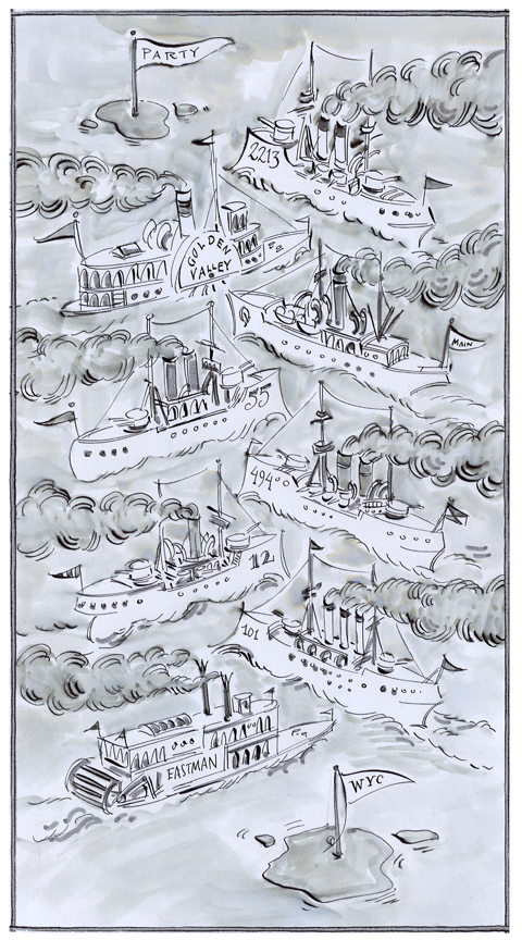
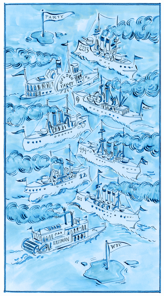
The map shows how to get from the Yacht Club to the after-regatta party at my brother's house. You just follow the fleet, zig-zagging ever north-eastward until you got to the driveway.
The smoke belching from the named or numbered boats (corresponding to the steets or highways) looked too much like the islands of the starting point and the destination, so back to the drawing board.
|
|
|
|
 |
|
|
|
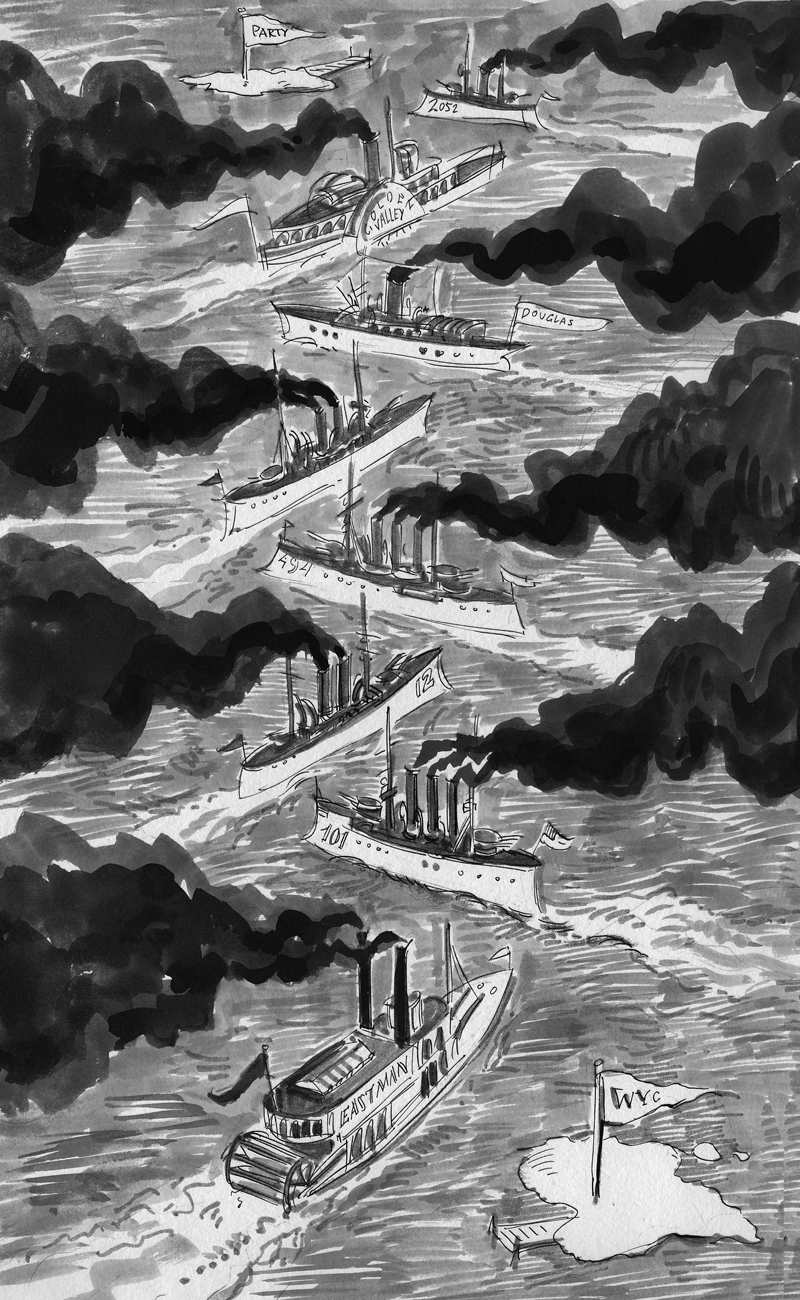
Still not right...too serious or something. He wanted it more playful.
Back to the drawing board I went.
|
|
|
|
 |
|
| I drew it again in a cartoony style and added the tonality in photoshop.
Still not playful enough, so more color added.
|
|
|
 |
|
|
|
It was cortoony by very dull, I thought, so I went back to the original pen drawing and added a light ink wash.
|
|
|
|
 |
|
|
|
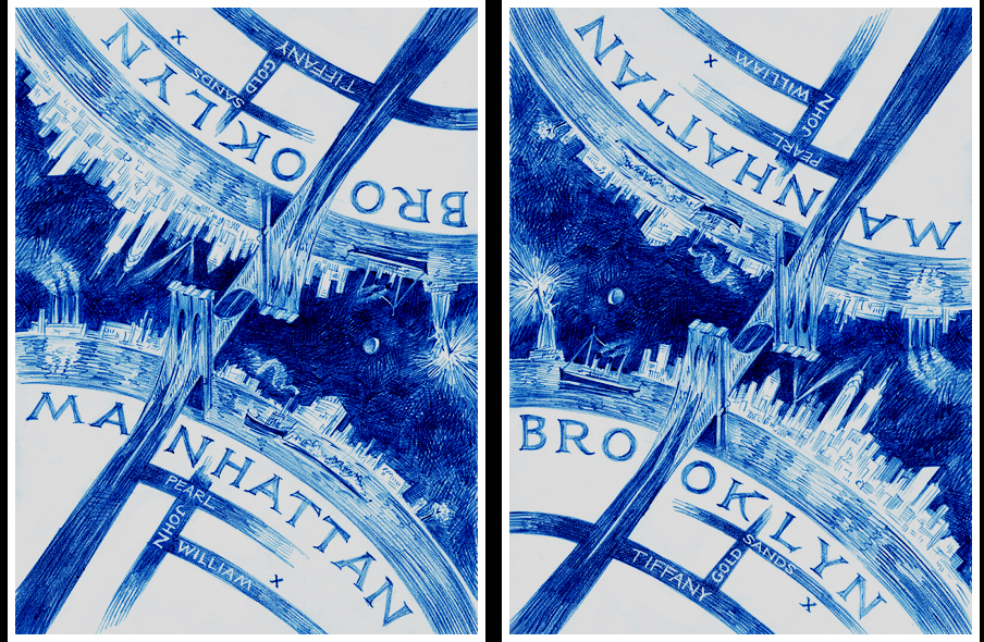
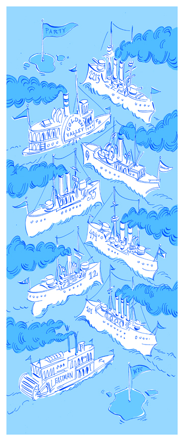
Better
Lots of life coming back.
Then in photoshop, I made it blue.
|
|
|
|
 |
|
|
|
 |
|
|
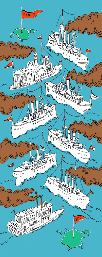
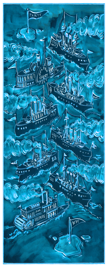
Then, finally added a bit of drama by reversing it so it appeared as if the fleet manoeuvers were at night.
Ta Da!
(at least I hope so)
The map was originally conceived as having numbered sailboats tacking back and fourth to the goal of a keg of beer. But the named streets were too long to fit on the hulls of the sleek racing boats....so I switched to steam power. The smoke, too, made the eye see the route better.
As for the route, There's a slightly more direct route which involved a couple of left turns in sequence...zig zag zig zag zig zig zag....an extra zig in there....so I made the guests travel about a half mile extra for art's sake.
T
|
|
|
|
 |
|
|
|
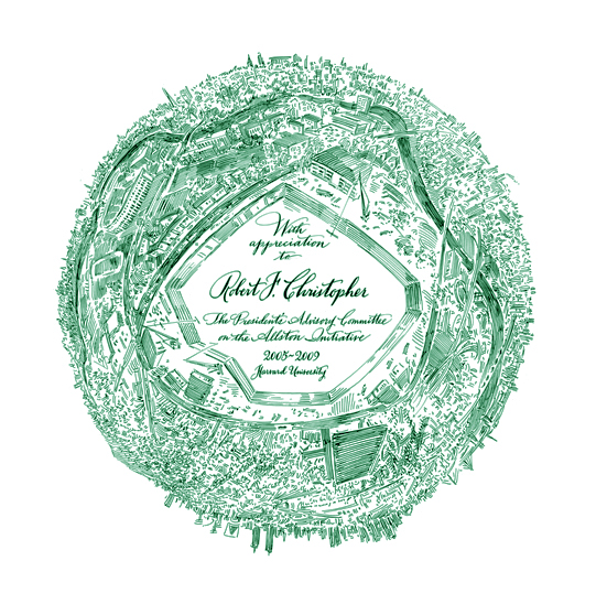
A map became a background for a certificate given to those people who helped plan a new science building for Harvard University. The hole for the foundation is as far as it got, unfortunatly.
|
|
|
|
 |
|
|
|
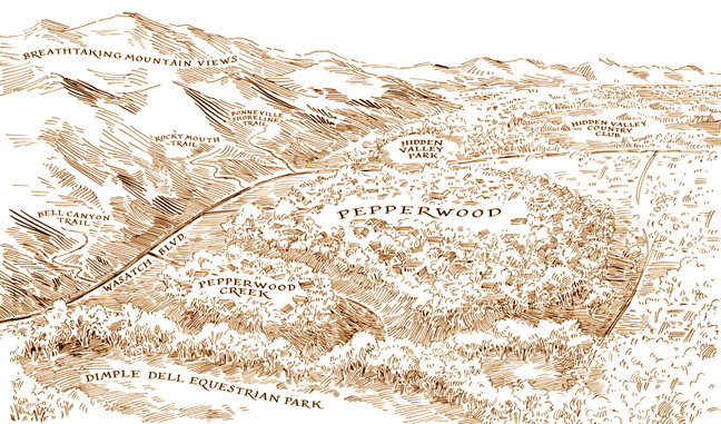
This project went further, actually building houses along the mountains in Utah.
|
|
|
|
 |
|
|
|
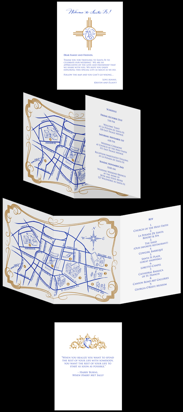
Santa Fe was the site of a recent wedding. A map was designed which included miniature drawings of the various venues. This compact map was all the guest needed to navigate the weekend's action-packed schedule of events.
The map was designed after the invitation had been designed and printed by another artist who used a number of differeing aesthetics (I thought). I pulled the elements from the invitation to be used as decoration on the map as well as morphing them to create the maps border which was a meld of the sun image from the front cover and the vines from the heart icon on the back.
|
|
|
|
 |
|
|
|
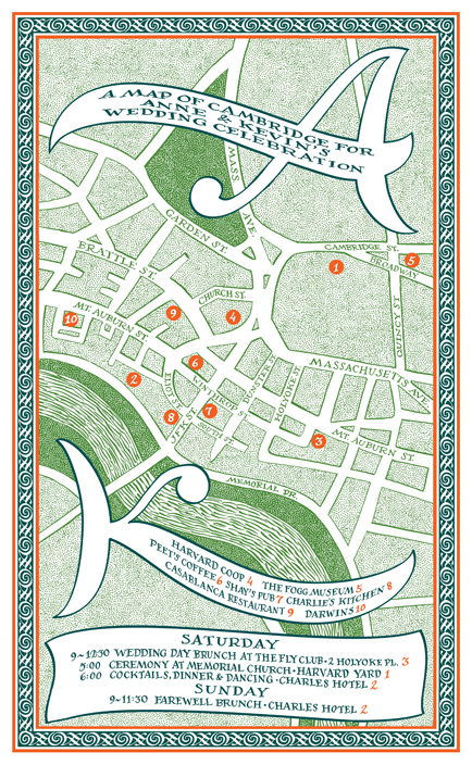
On this map, we just used a numbered key without drawing the many buildings...mainly as the buildings were rather dull. The clients initials became the area for most of the text and title. You also see the K and A appear repeated on the border below.
|
|
|
|
 |
|
|
|
 |
|
|
|
Click on the links below to navigate this site.
|
|
|
|
|
|
|
|
|
|
|
|
|
|
|
|
|
|
|
|
|
|
|
|
|
|
|
|
|
|
|
|
|
|
|
|
|
|
|
|
|
|
|
|
|
|
|
|
|
|
|
|
|
|
|
|
|
|
|
|
|
|
|
|
|
|