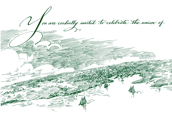
Hand-Wrought Invitations
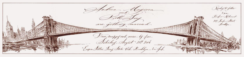
The image above was not only symbolic, showing the connecting of two people as one, but also showed the location of the wedding ceremony held at the park at the base of the Brooklyn Bridge.
It interlocks when the invitation is closed and becomes the shape for the text when opened.
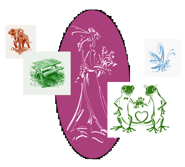
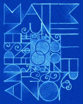
I include a few of the non-wedding invitations here as well.
The matching placecard is shown below.
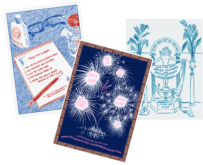
Invitations to events other than weddings can be seen here: Party Invitaions.
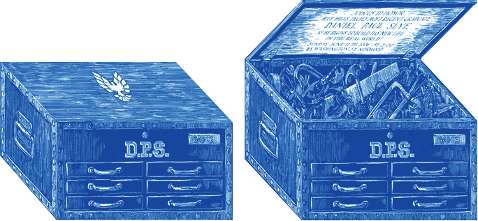
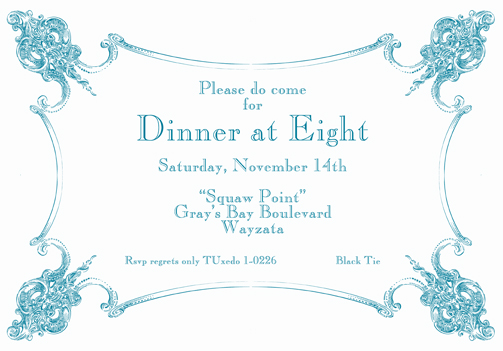
I'm not sure The US military's silly policy of "Don't Ask, Don't Tell" includes a ban on communications that are blind embossed covered in gold foil.
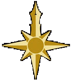
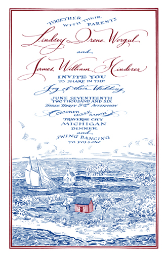
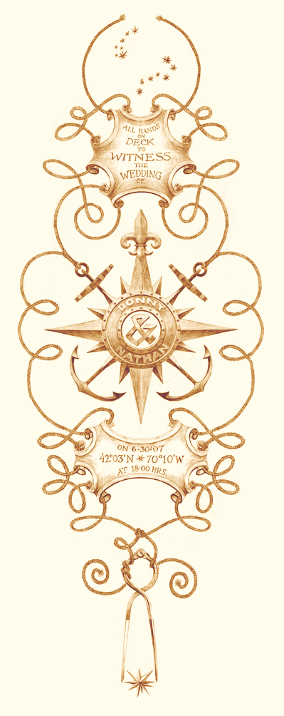
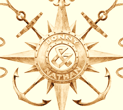
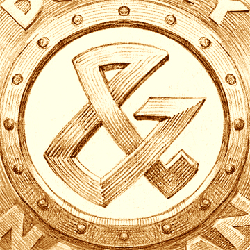
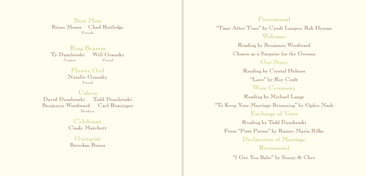
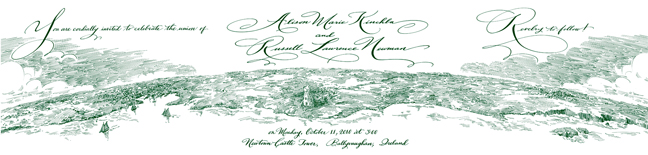
Here we see a delightful invitation that tells a romantic story. These sailors met in Celestial Navigation 101 and the rest is history. You see the constillations Ursa Major and Ursa Minor at the top. The english translations soon became their nicknames for one another (Big Bear and Little Bear). At the center you see a compass rose surmounted by their names rivited to a round shield at the center of which is a hunky ampersand.
Following the ropes to the bottom we pass through the banner showing the location and time of the wedding in longitude and latitude, (Provincetown, Mass, at 6 pm for you landlubbers) then come to the knot, of course, symbolizing the union. They continue on and wrap themselves about the arms of a navigational divider which is measuring the magnitude of a new star. That was their wedding present to one another: their names officially designated (for a small fee) to a particular star in Orion.
Very sweet I think!
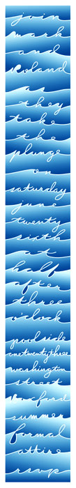
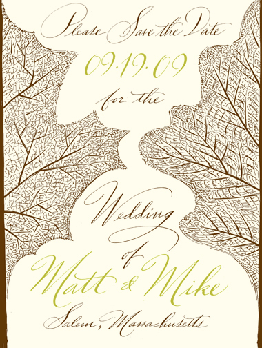
So with that "equality" in mind, I thought that it might be interesting to design something where not even one name is listed before another. One of those ideas you see above.
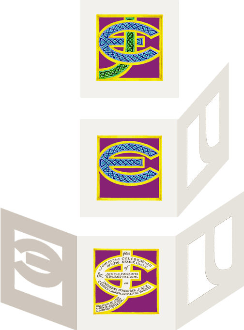
Turning the card in a counter-clockwise manner you read the names of the grooms on the outer ring. Spiraling inward you read the place and location. The two interlocking rings in the center tell you that a wedding's going to take place. The color and design was inspired by their architectural professions and design aesthetic.
They eventually felt this was a bit hard to read, which it was, admittedly, and chose something that you didn't have work so hard at reading.
To see other examples of a complete suite from the save the date to the thank you note visit my Ensemble page.
PRODUCTION OF THE INVITATIONS
Once the design is finalized I can send you the digital files so you can have them printed locally. Depending on your taste and budget they can be engraved, letterpressed or offset printed. You can even print them on your home computer! To see some actual examples of design costs, check out this page.
Or, if you prefer, I can manage their production using local Boston area print shops.
HOT OFF THE PRESS
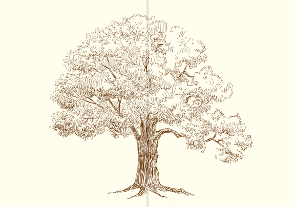
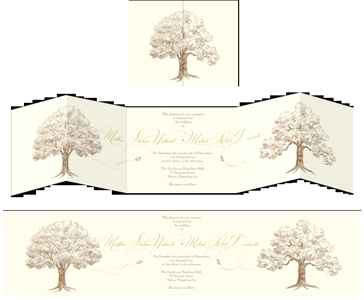
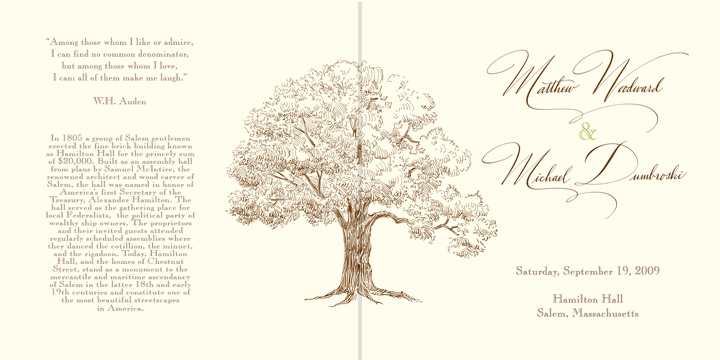
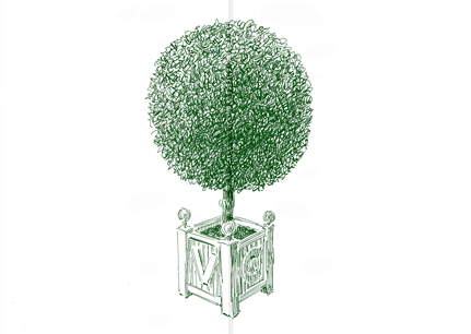
A recent client asked me to design an invitation based on botanical drawings of trees.
We decided a simple leaf or two would be great for the save the date postcard.
We saved the tree for the big event.
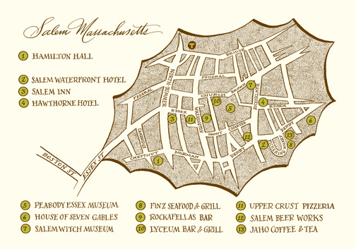
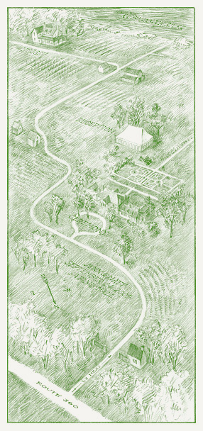
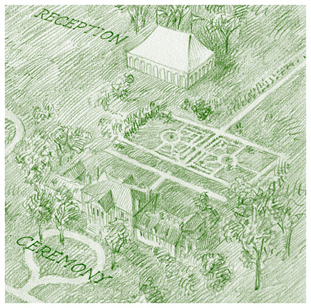
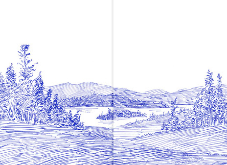
The same map was used as part of the guest welcome basket. We changed the back to show a complete schedule of events.
It began rather modestly, but thankfully, we expanded it to something really grand.
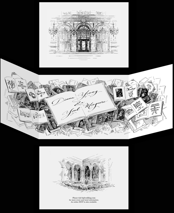
The clients originally wanted a small image of the Boston Public Library to appear at the top of the invitation. That sort of design would be perfectly fine for any couple getting married at that location.
How could I design it differently to make it perfect for JUST them?
We came up with the plan showed above. The closed "gate-fold" card showed the elaborate entrance to the BPL: iron gates and bronze doors flanked by ornate gas lamps. (These beautiful architectural details would have been lost in the small icon originally planned.)
Upon reading the very concise wording of the invitation, I suggested we depict a cascade of open books which could contain the text. We also had extra covers and open pages to include numerous illustrations and icons meaningful to them. Science, mathematics, music and art were among their many interests.
The back of the invitation showed an image of the Library's courtyard, the location of the ceremony.
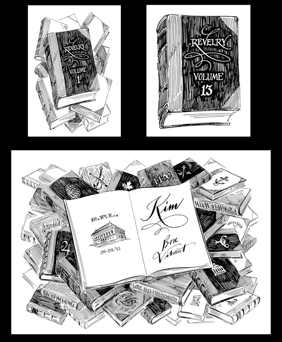
Once at the table they found a place card shown above. In this case I drew a pile of books which contained titles and icons meaningful to ALL the guests attending. Family and friends from each of their long-past seperate lives recognized places visited or hobbies they shared with them. Fellow students at MIT idenified the Title "Principia Mathematica" and the icon of the school and the lamp of learning.
Each guest had their name calligraphed on the title page of the single open book. Below their name was written a "subtitle" composed especially for each person. The task of writing a short descriptor turned out to be a little more difficult than they had originally thought. They knew way too much about their guests to condense it....I offered a few suggestions including thinking of how they might briefly describe the guest to a complete stranger..."Oh, he's a perfectionist" or "She loves to laugh, often and loudly" became the new starting point.
These 5 by 7 inch cards were also the party favor for the event. A meaningful unique gift to each and every guest.
In Conclusion...
Though I can design more traditional ones, the invitations I show on this page are good examples of non-traditional design...or even thinking! I'd like you to consider the possibilities of having me design something that has NEVER been seen before. Something that is beautiful, creative, symbolic, individual, and, most importanly, has meaning.
Party Invitations will show you many more examples of non-wedding invitations.