|
|
|
Hand-Wrought Monograms
|
|
|
|
 |
|
|
|
Monograms made up of the intertwined initials of a couple are an elegant way to symbolize your new union. They can illustrate your similar - or diverse - personalities, reflect the aesthetics of the invitation, or even tell a specific story. The sky's the limit when we design something for you from scratch.
|
|
|
|
 |
|
|
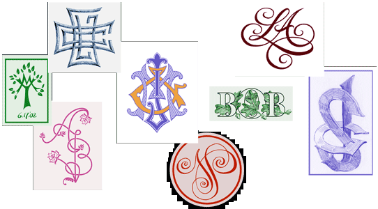
| Most traditional monograms have been composed of two or three initials in the same typeface overlapping in some way. The choice of font is important as each has its own mood. With that in mind we can use two contrasting lettering styles to describe the different personalities involved in the union. But we need to make sure there's some connection between the two, such as in the technique of rendering, or they'd clash violently. We certainly don't want that, do we? |
|
|
 |
|
|
|
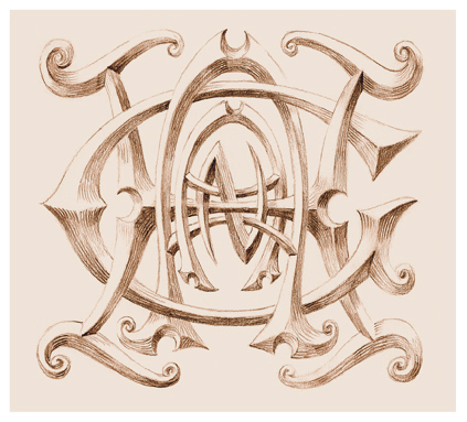
Here's an example of hand-wrought letter forms which describe the characters of the individuals. This was designed for a couple who seemed to illustrate the maxim that "opposites attract." None of their friends figured their romance would ever last. He, Kurt, was angular, logical and exact; she, Brenda, rather carefree. Yet over time they did take on a few of the other's characteristics... as shown at the very end of their initials.
|
|
|
|
 |
|
|
|
So-called "Gothic" monograms were quite the rage in Victorian times. They are enjoying a comeback today as well. The letterforms are whacky, fun, contorted and sometimes even reversed. They have odd twists and turns in them which defy most laws governing letter design. The gothic "cypher" (a design using all the letters in a name, "Hagan", in that case) shown below was designed to be carved in a mantlepiece.
|
|
|
|
 |
|
|
|
How many initials in a monogram?
Usually two. I like the equality of two initials for a wedding invitation. Once the couple is married and they share a common last name, we can add a third initial to represent the new union. Traditionally the last name's initial is larger and in the center flanked by the two first name initials.
|
|
|
|
 |
|
|
|
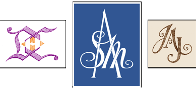
The monogram at the left was designed to be printed on a deck of playing cards which were given out as party favors. The initials of Debra and Carl overlap to form the now-shared last name of Henreid. The central one shows the line connecting the initials of Sam and Mary become the cross arm of the name Adams. Jane and John Anderson's monogram is interesting in that each of their first names are designed following tratitional cursive and printed fonts but their jointly-owned last initial has elements of both. Like the car they drive, it's a hybrid.. |
|
|
|
 |
|
|
|
In this example I designed a two-letter monogram which was printed on the invitation then morphed into a similar three-letter monogram which was used on the thank-you cards. Note how the letters are interconnected by one line. |
|
|
|
 |
|
|
|
How will the monogram be drawn?
The answer might be in where the monogram will be placed. If it is to be engraved on silver, the drawing will be designed in pen and ink. If the silver tea set is very baroque then the monogram ought to follow. The medium is only one concern. How many colors might it have? Will it be playful or somber? Will it be modern and cutting edge or traditional? Realistic or abstract? All of the examples above include some flower or tree imagry as a part of their design, yet they all are very different.
|
|
|
|
 |
|
|
|
Monograms can also be part of an illustration.
The one at left shows the initialled wedding bands of the couple. It was used on the cover of the program.
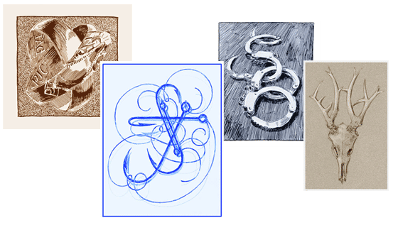
The fishook monogram tells a story. My younger brother (Troy) and his wife (Sue) met while each was competing to catch one of the thousand fish which swim in the ten-thousand lakes of Minnesota. Their lines became entangled and the rest is history. You might think that fishing is a odd image for a wedding invitation. It would be strange for the vast majority, but not for these two: they love fishing. Their friends love fishing. Even the mother of the bride loves fishing. (The only person at the wedding who didn't know which end of a fishing pole to put in the water was me.)
The handcuffs may at first glance seem a bit "dark." This is not an attempt of the artist to suggest that married life is confining, but actually depicting the occupation of the couple. Both Sandra and Burton are two of Boston's finest. Billing, cooing and ticketing as they head off into married bliss.
The antlers of the skull spell out the initials for Ellen and Kevin Hanson. I designed this for their thank-you cards they were to compose while on their honeymoon, relaxing on the veranda of a dude ranch.
|
|
|
|
 |
|
|
|
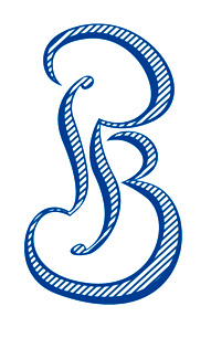
This arrangement of a pair of letters was inspired by a story in Greek mythology (fron the Symposium by Plato). It relates how we humans strive (literally) for our "other half." Here we see the vertical stroke of the B actually belonging to the P and visa versa. Each letter makes up half of the other. The couple in question are part of the classics department of a New England college. |
|
|
|
 |
|
 |
|
|
|
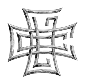
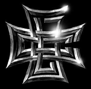
HOT OFF THE PRESS...(and the foundry) are these two renditions of a monogram designed for a biker couple who got married recently. The initials of Grace LeFevre and Charles "Chopper" Conroy are seen arranged in the shape of an iron cross, the icon commonly associated with their social circles. The image at left was engraved on the invitations and the one on the right cast in chrome-plated metal and affixed to the sidecar last seen speeding down their honeymoon highway.
|
|
|
|
Here follow a few more examples of some new monograms. I hope you will enjoy them.
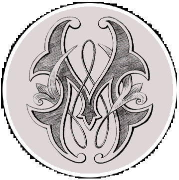
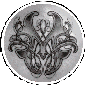
My first Tattoo! Or at least my first tattoo design, that is.
|
|
|
 |
|
 |
|
|
When designig a tattoo, I want to make sure that I do not step on the toes of the other artist involved. The tattoo artist him-or-herself will probably want to add their own technique of shading and color. I try to make sure the final drawing I give to the client suggests that it is merely a foundation for them to build on.
You see how the "real" tattoo was actually rendered "in the flesh" ...on the flesh. The tattooist decided to add many fine lines and use a different shading technique.
To see more tattoo designs, click TATTOO.
|
|
|
|
 |
|
|
|
The same two initials are seen in this monogram I designed for use on a custom postage stamp. |
|
|
|
 |
|
|
|
These four jazzy initials represent two neighboring artist communities (Joy Street Studios & The Brickbottom Building) collaborating in their annual Open Studio Event. |
|
|
|
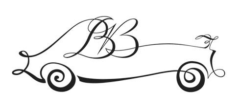
Sometimes a monogram will need to do some actual work. It will need to be flexible or versitile throughout its life. Here's a case in point. |
|
|
|
 |
|
|
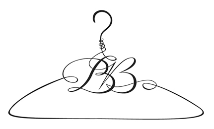
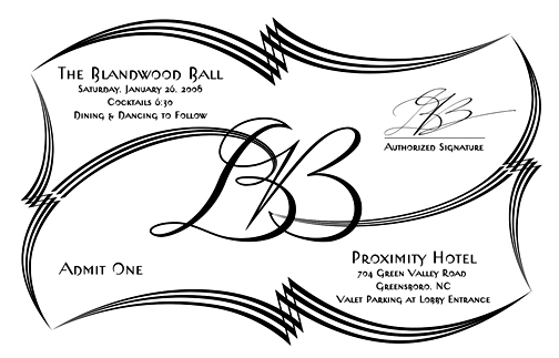
The yearly Blandwood Ball was being given a facelift. Many elements of the event were to be made vibrant and exciting. Previous year's invitations showed rather staid conservative very formal monograms and script. They wanted something a bit more modern and vibrant.
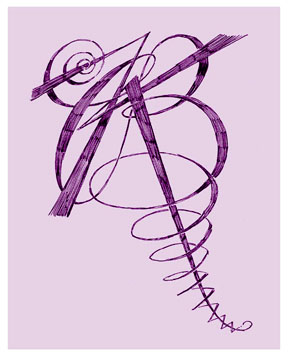
I suggested this pairing of letters. Each, in my mind, suggesting the angular gentleman dancing with the curvacious lady.
But wait...there's more....
|
|
|
|
 |
|
| Here's the monogram used on the flyer describing the orchestra's music programme. |
|
|
|
 |
|
|
|
And here it defines the required dress code for the evening. |
|
|
|
 |
|
|
|
Here it is atop the menu. |
|
|
|
 |
|
|
|
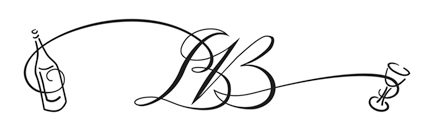
And here, describing the accomodations. After all the dining, drinking and dancing, some guests could simply take the elevator to their reserved hotel rooms. It appears that the man has had a bit more of the bubbly, as suggested by his wayward path. |
|
|
|
 |
|
|
|
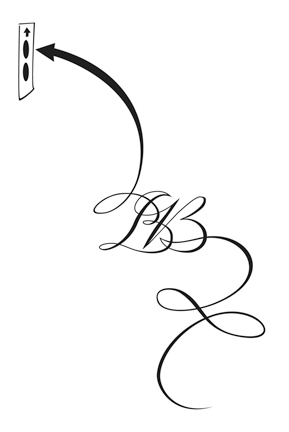
Those not staying overnight were presented this coat-check ticket.... |
|
|
|
 |
|
|
|
and gave this ticket to the valet. And soon they were on their way home.
The perfect end to the perfect evening.
|
|
|
|
 |
|
|
|
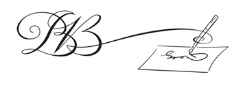
Even writing the check for the event was made easier with the help of the clever workhorse of a monogram.
|
|
|
|
 |
|
|
|
 |
|
|
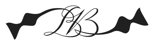
The ticket, shown above. has the monogram's terminal lines becomming the swanky geometric-calligraphic border inspired by stock certificates. |
|
|
|
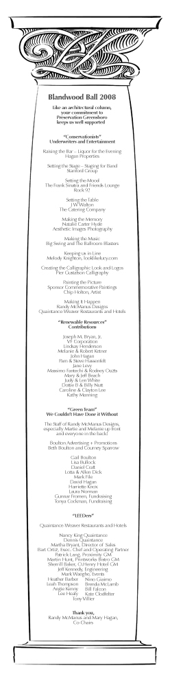
The Event's Program, shown at right, was a 25 inch long column filled with text. The money raised at this ball was to be used in restoration of many architectural wonders of historic Greensboro, so I felt it was fitting that the supporters of the event were listed on an actual architectural support...a "Corinthian column" of sorts, capped with a carved version of the logo. |
|
|
|
 |
|
|
|
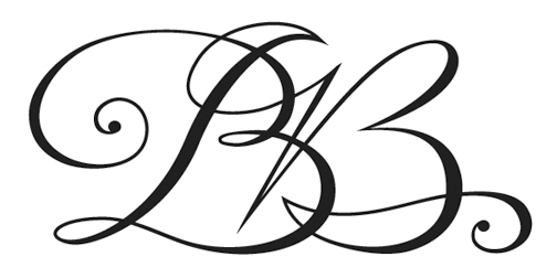
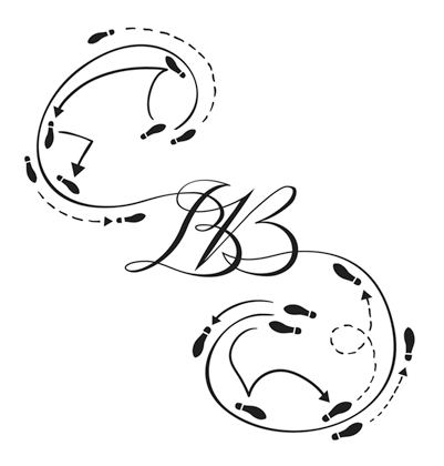
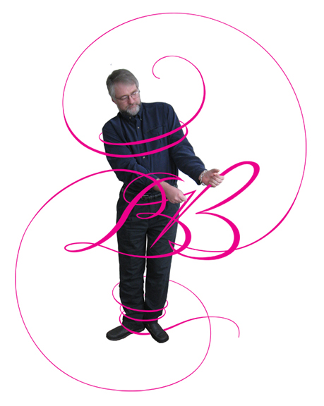
Morphing the BB logo into all these variations was pretty tough work and sometimes it seemed to get the better of me.
Most monograms will not require such gymnastics from it (or the artist).
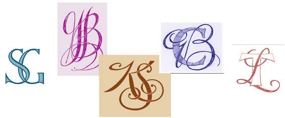
Yet, more often than not a monogram may need to have at least one variation required by your printer, engraver or stone-carver. Sooner or later simplifications or elaborations may need to be made.
I'll show you a couple examples of these slight variations below.
|
|
|
|
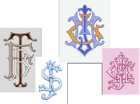
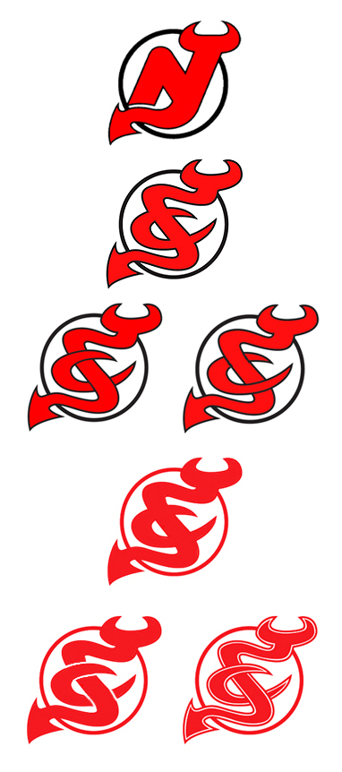
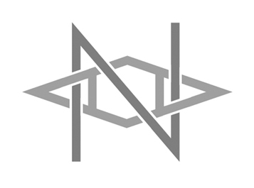
In a perfect world a single monogram would work in all possible renditions, but there's times when that isn't possible. Here's a case in point. The New Jersey Devil's (a hockey team I have been informed) logo was to be adapted for the use in a boy's Bar mitzvah celebration. You see the relativly straightforward transformation from the original logo to the boy's logo at the top. Some variations suggesting depth are shown below. |
|
|
|
 |
|
|
|
The first rendition was all well and good if this was going to be used only once, printed on the invitation, for example.
BUT I also knew it was going to be printed on napkins. Color registration on flimsy paper napkins rarely works out well, and it will always be more expensive. So I offered the client a single-color version of the same monogram. I also provided a couple of adaptations which made the boy's initials seem more readily readable.
Re-designing a two -or more- color monogram as a single color can be very difficult. It is best (and probably cheapest) for me to know if that is required before I begin.
|
|
|
|
 |
|
|
|
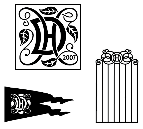
Here's another monogram which ended up being used in a number of venues. The initial one was to be embossed in a ceramic tile to be placed in the house's fireplace mantle.
When it was to appear on the weathervane I had to simplify it. The white lettering was to be "cut out" of a flat copper sheet. Keeping the detail within the leaves, for instance, wouldn't have been possible.
A third rendition simplified it further. It was to be used on a wrought iron gate. Here all the linework needed to be the same diameter and the composition spread out horizontally to fit the scale of the gate.
Eventually, if asked to design it for use on an engraved letterhead, I may suggeest we go the other way, adding detailing to the vines and leaves.
|
|
|
|
 |
|
|
|
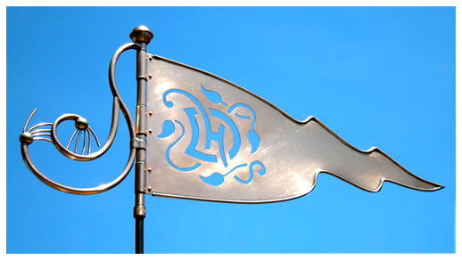
Here's the weather vane in reality! I guess the client preferred the single-pointed version.
|
|
|
|
 |
|
|
|
For no particular reason, I'll end with this one.
A frantic client called with an urgent problem. The monograms that had been provided her were not working. Three designers had given it their best shot but struck out.
The monogram was to go atop an engraved invitation which had the most flowery script I have ever seen. Beautiful, to be sure. But quite difficult to work with. It was like "Make a workable recipe using a gallon of molasses."
One of the failed attempts had simply used the same typeface as seen on the invitation, but three capital initials atop one another other looked like a tangled, allbeit elegant, hair ball coughed up by a persian cat.
The second designer provided variations using ornate Roman letters which only competed with the script.
Normally, a monogram's letters are fancier than the text below. In this case, I saw it had to be the opposite. I insisted that the "less is more" directive was appropriate, and really required. Make it bold and simple, but it had to have something else....It needed to be slightly "quirky."
Voila!
The client smiled, I smiled.
|
|
|
|
 |
|
|
|
To see how the initials YMH were designed in many various monograms click here.
|
|
|
|
 |
|
|
|
To see how the monogram shown above was designed from start to finish, click here.
Once the design for your monogram is complete, I will send the digital file to you or the person or company designing your invitations.
More monograms may be seen on the "what's new" page.
To get an idea of what the design costs might be for your monogram, please study my monogram pricing page.
|
|
|
|
|
|
|
 |
|
Click on the links listed below to see the following:
|
|
|
|
|
|
|
|
|
|
|
|
|
|
|
|
|
|
|
|
|
|
|
|
|
|
|
|
|
|
|
|
|
|
|
|
|
|
|
|
|
|
|
|
|
|
|
|
|
|
|
|
|
|
|
|
|
|
|
|
|
|
|
|
|
|
|
|
|
|
|
|
|
|
|
|
|
|
|
|
|
|
|
|
|
|
|
|